Citrix × Allen & Gerritsen × Nathan Love
Citrix Workspace Stories
Animated stories shaped around the real quirks of people using the platform.
Why It Matters
Remote work exposed something simple. Every workspace is personal. Every habit is cultural. Tools only matter when they honor that truth. The agency came in wanting representation that felt lived. Not a checkbox, not a casting list. A world where real people could see themselves. Our direction carried that forward. Characters with specific faces, specific setups, specific rhythms. An animation language that felt drawn by a person, not generated by a template. The work mattered because it treated technology as a human space, not a product demo.
What we make
- Five animated films
- Character-driven explainers
- Looped platform visuals
- Platform-specific cuts
Clearer understanding of Citrix’s tools through scenes that felt culturally true.
No items found.
Story
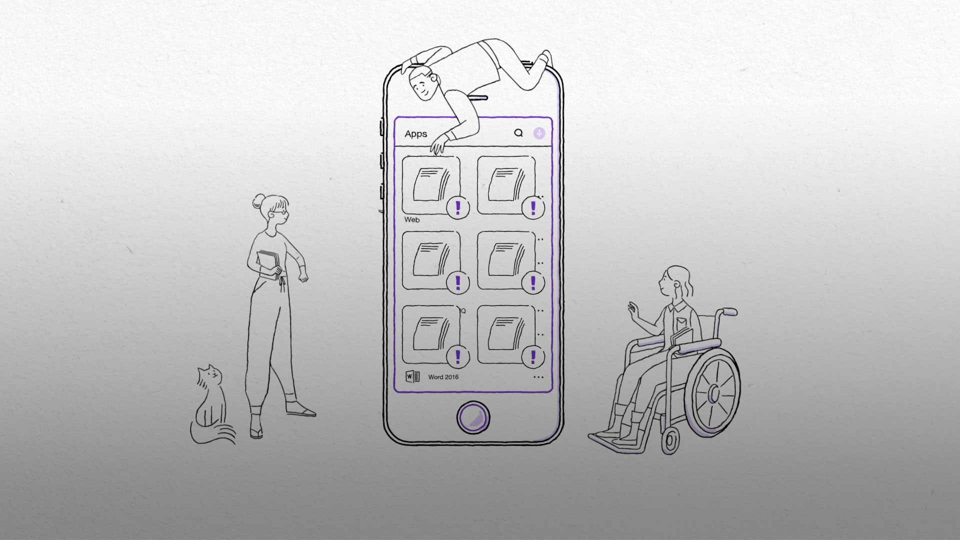
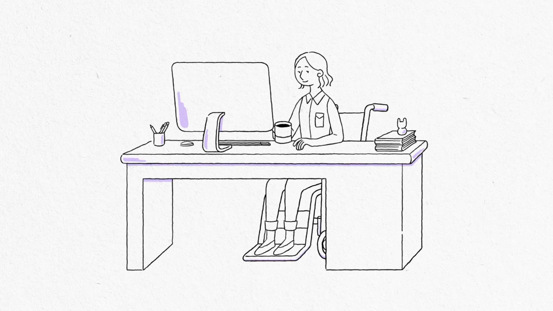
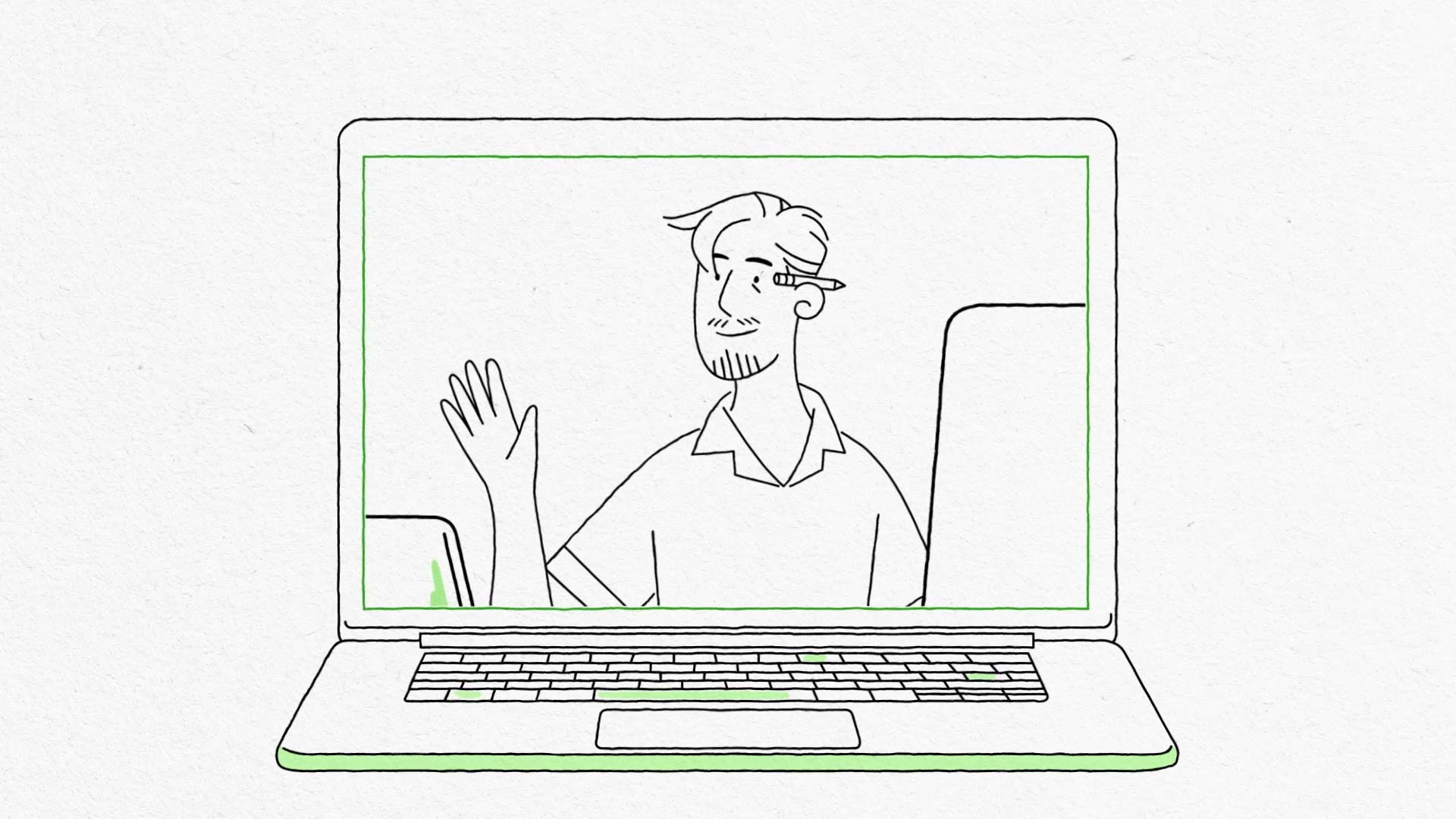
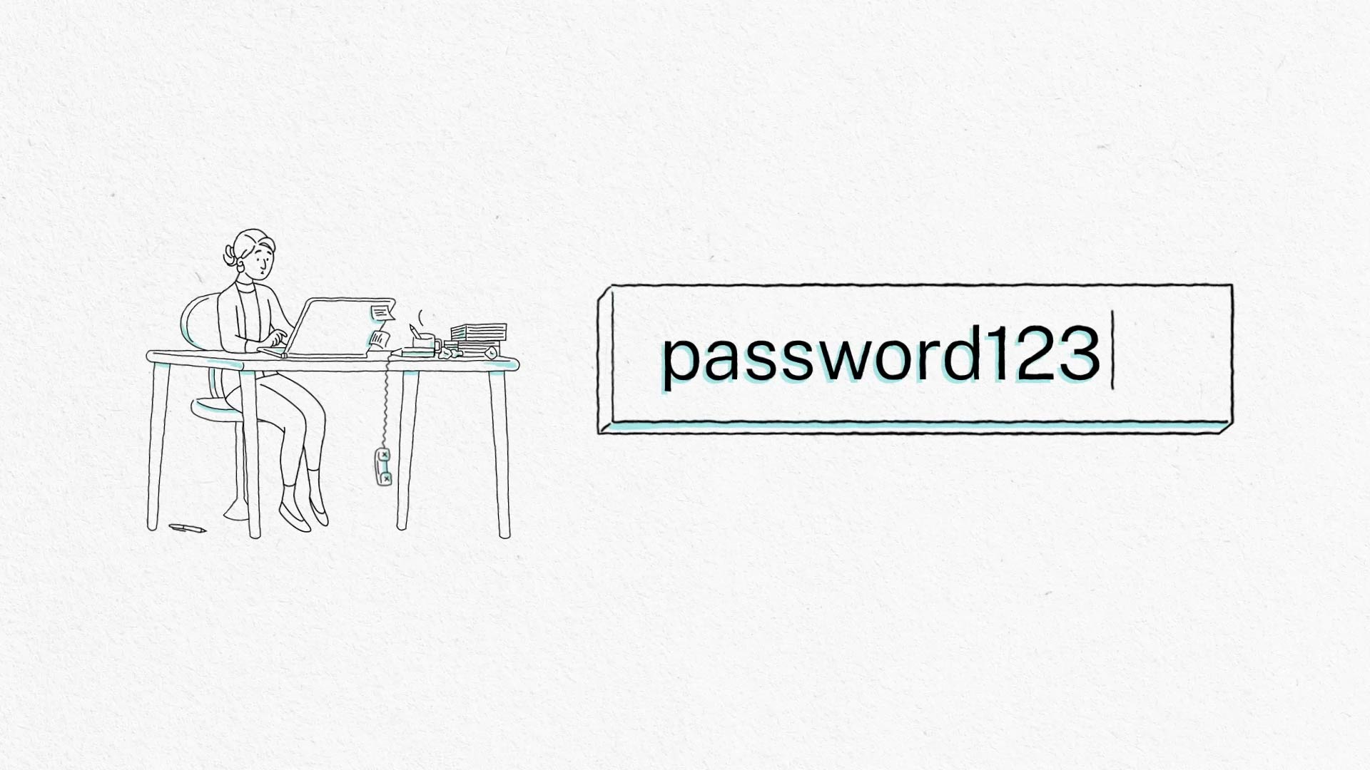
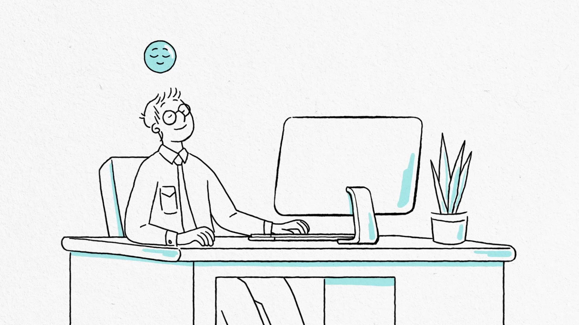
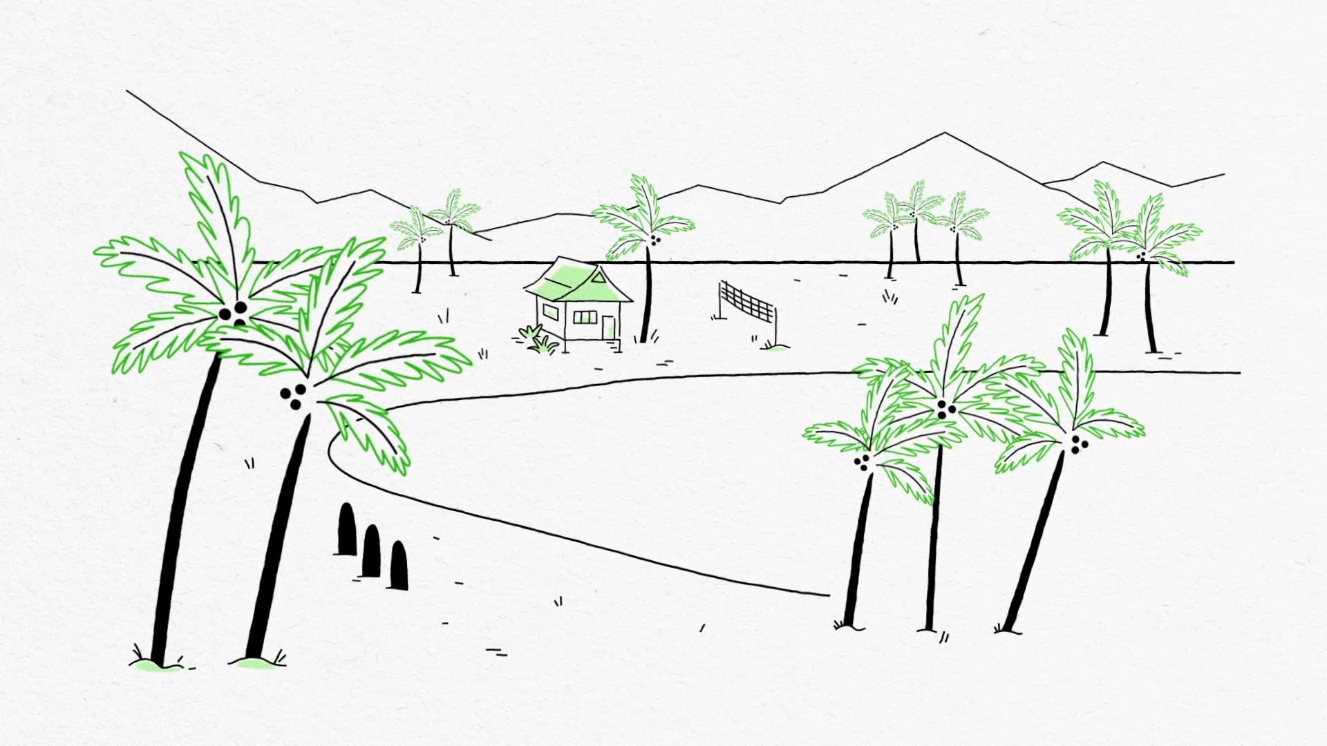
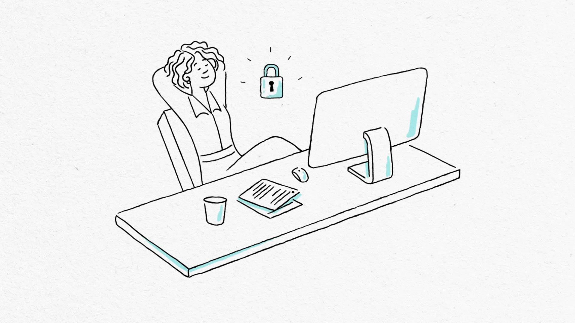
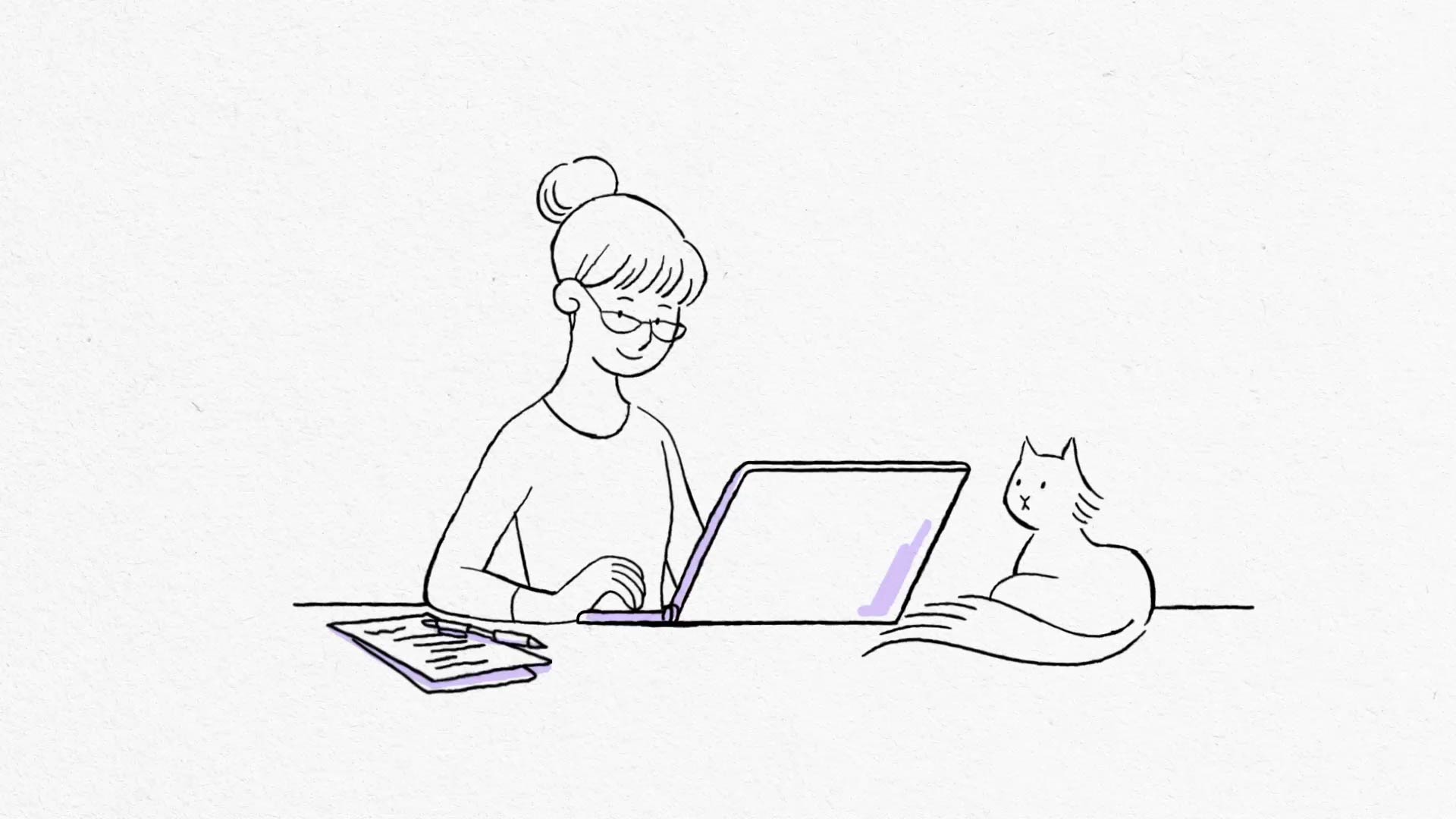
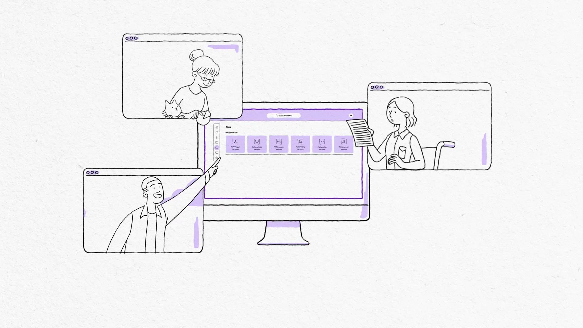
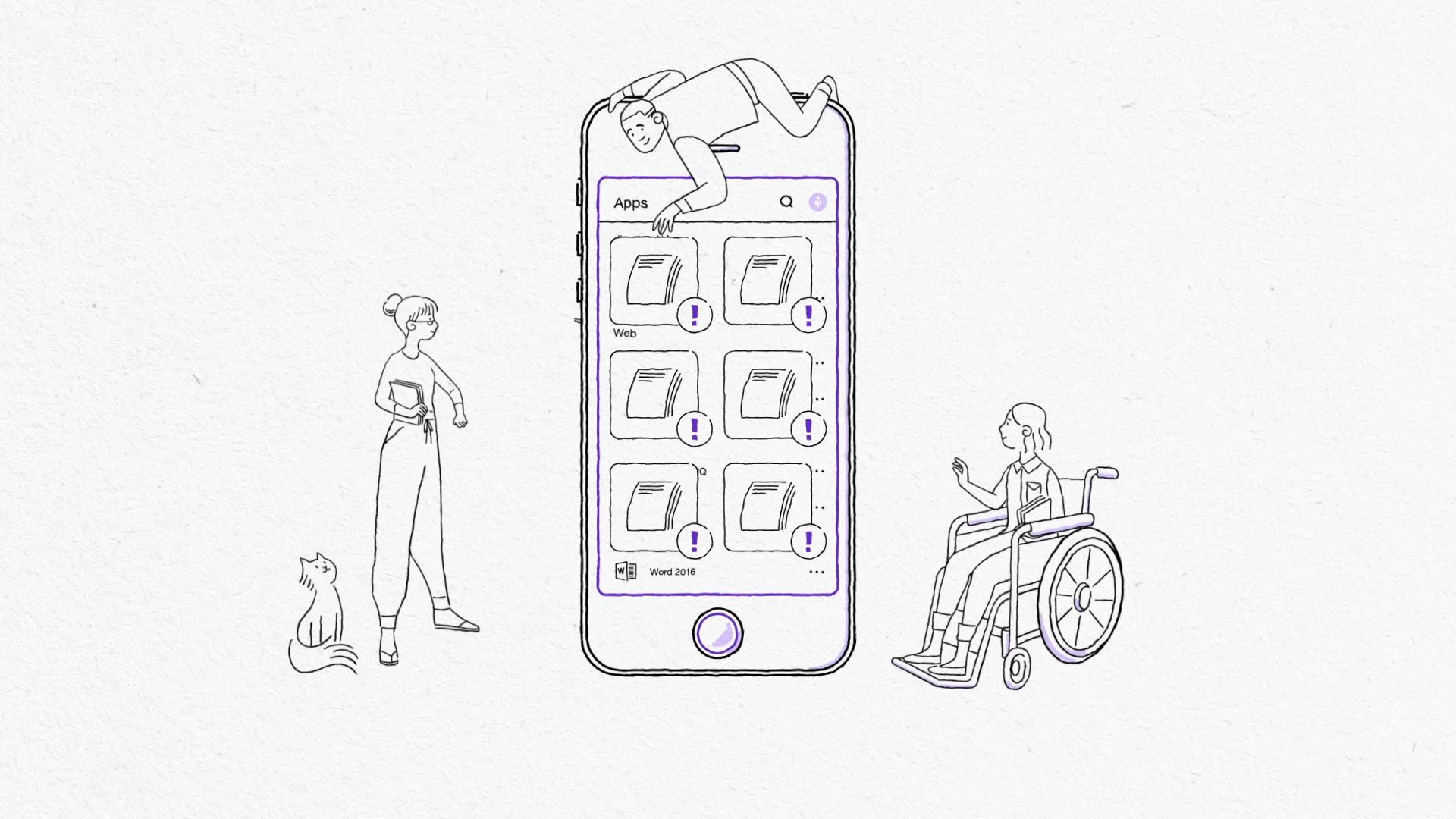
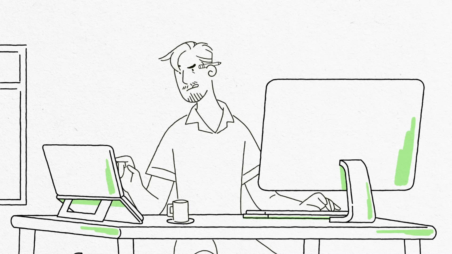
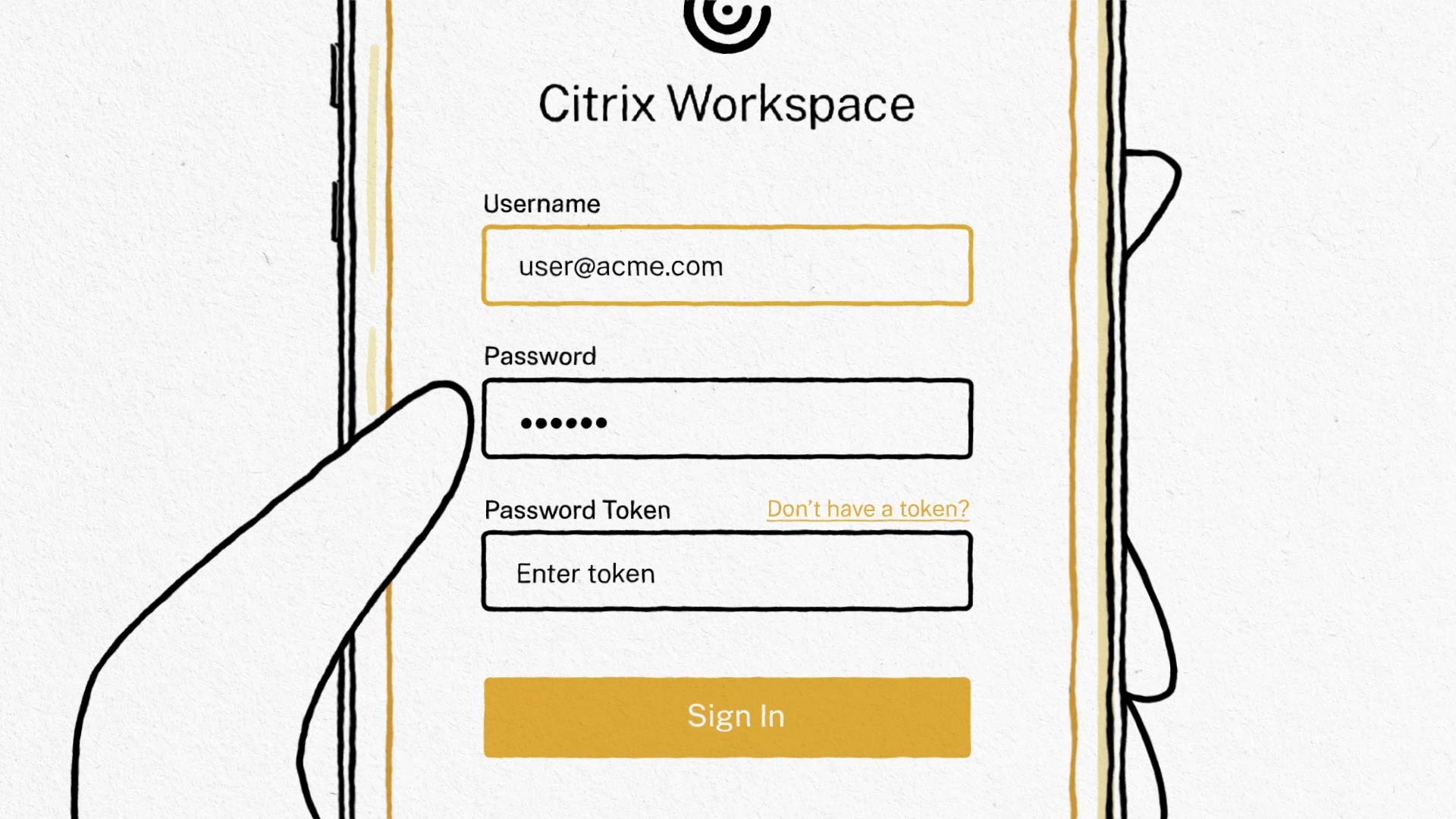
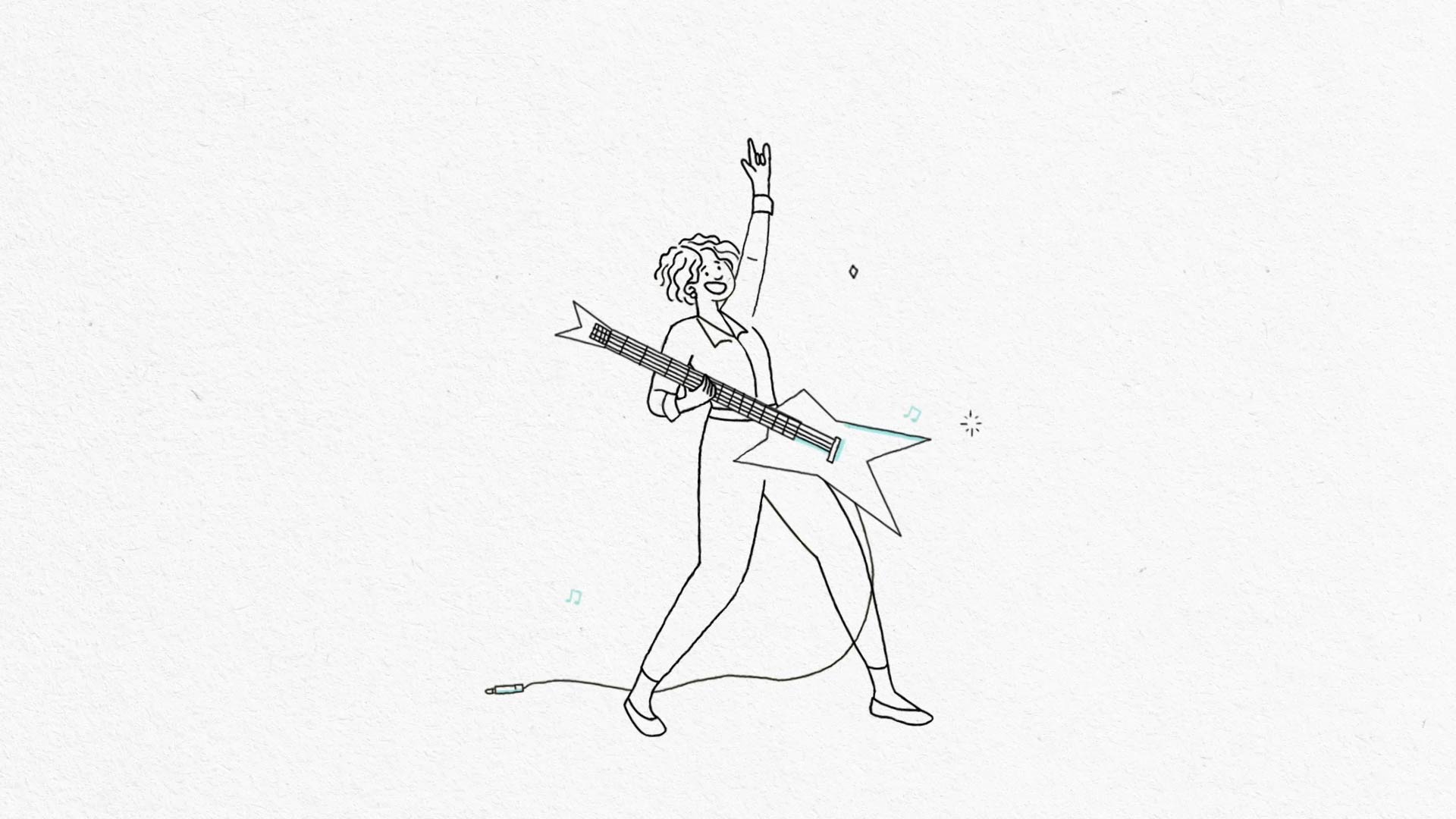
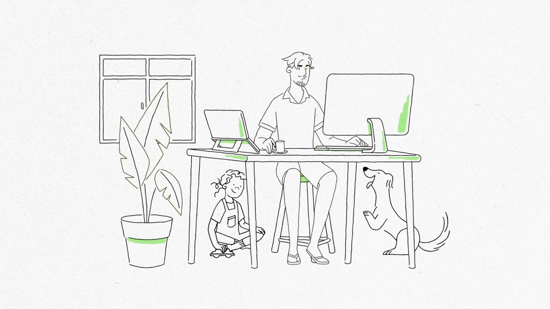
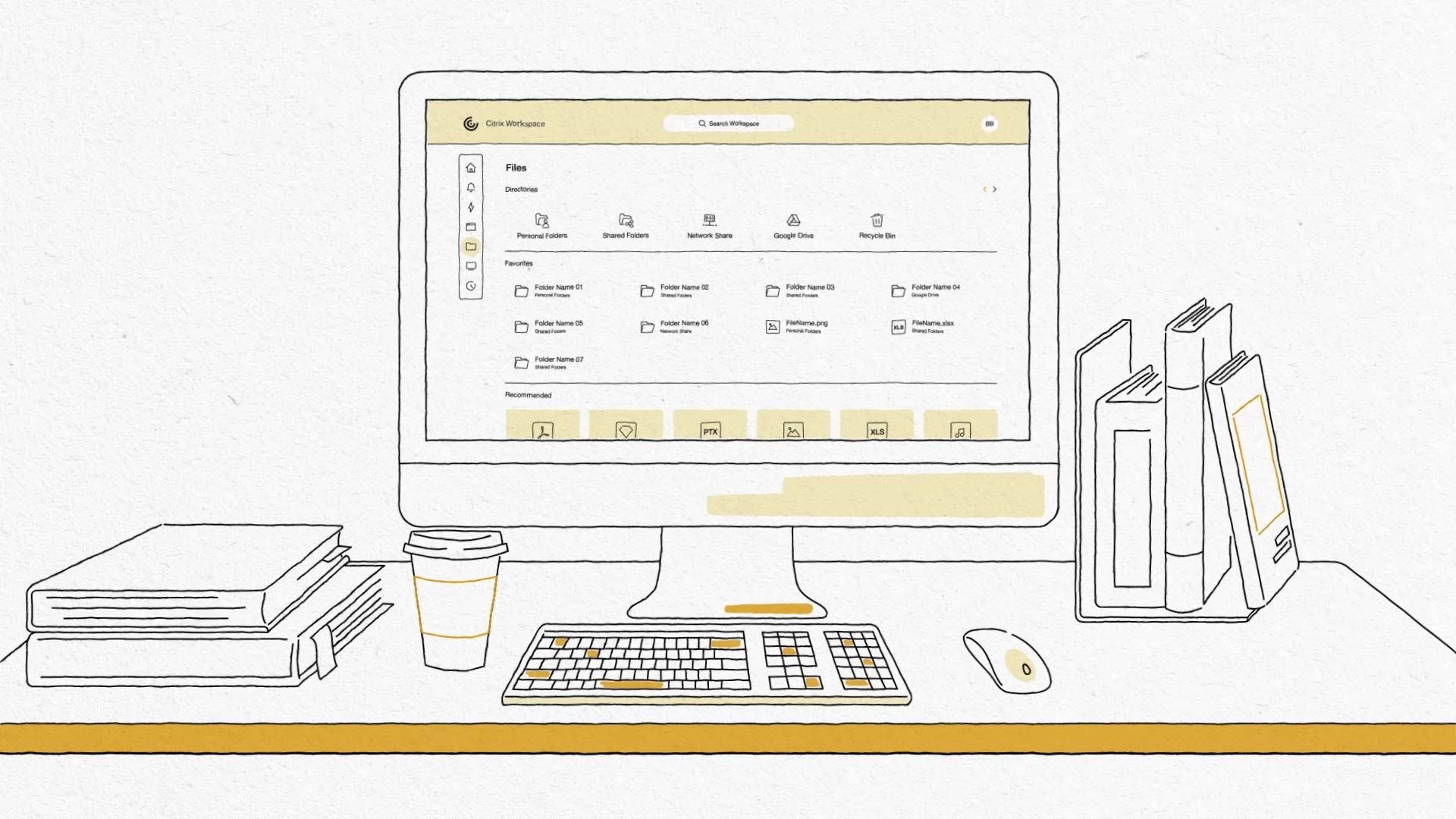
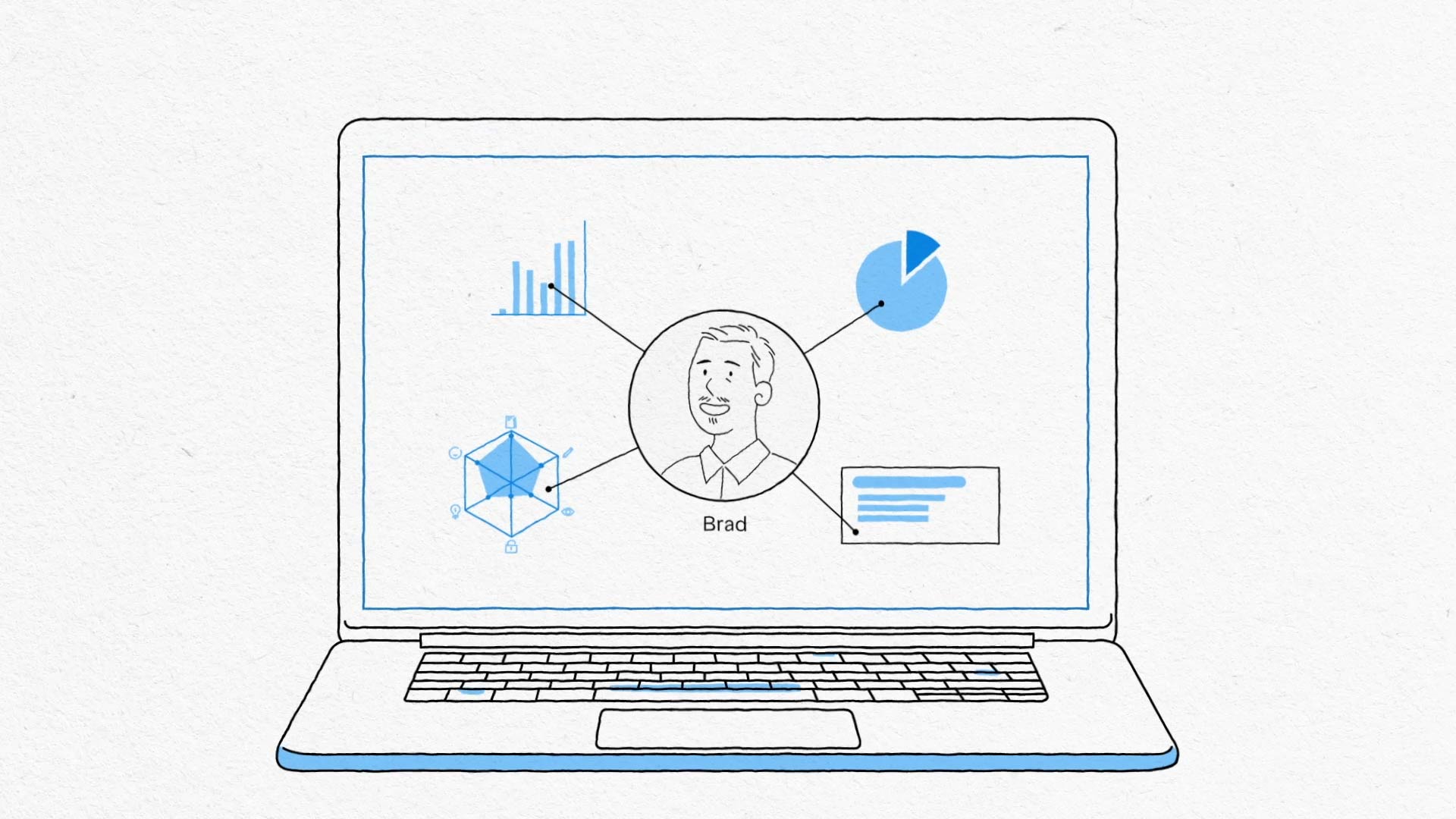
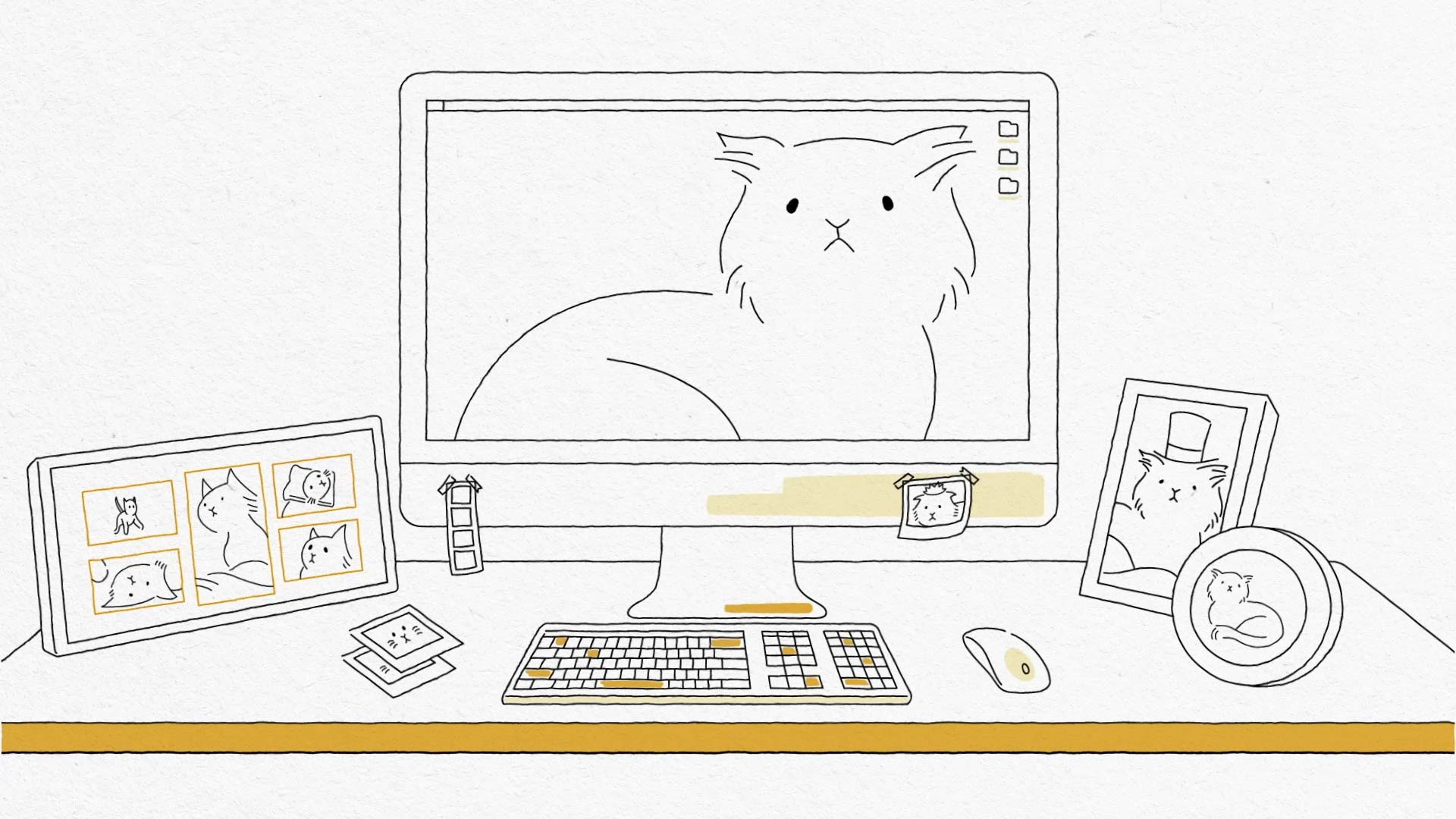
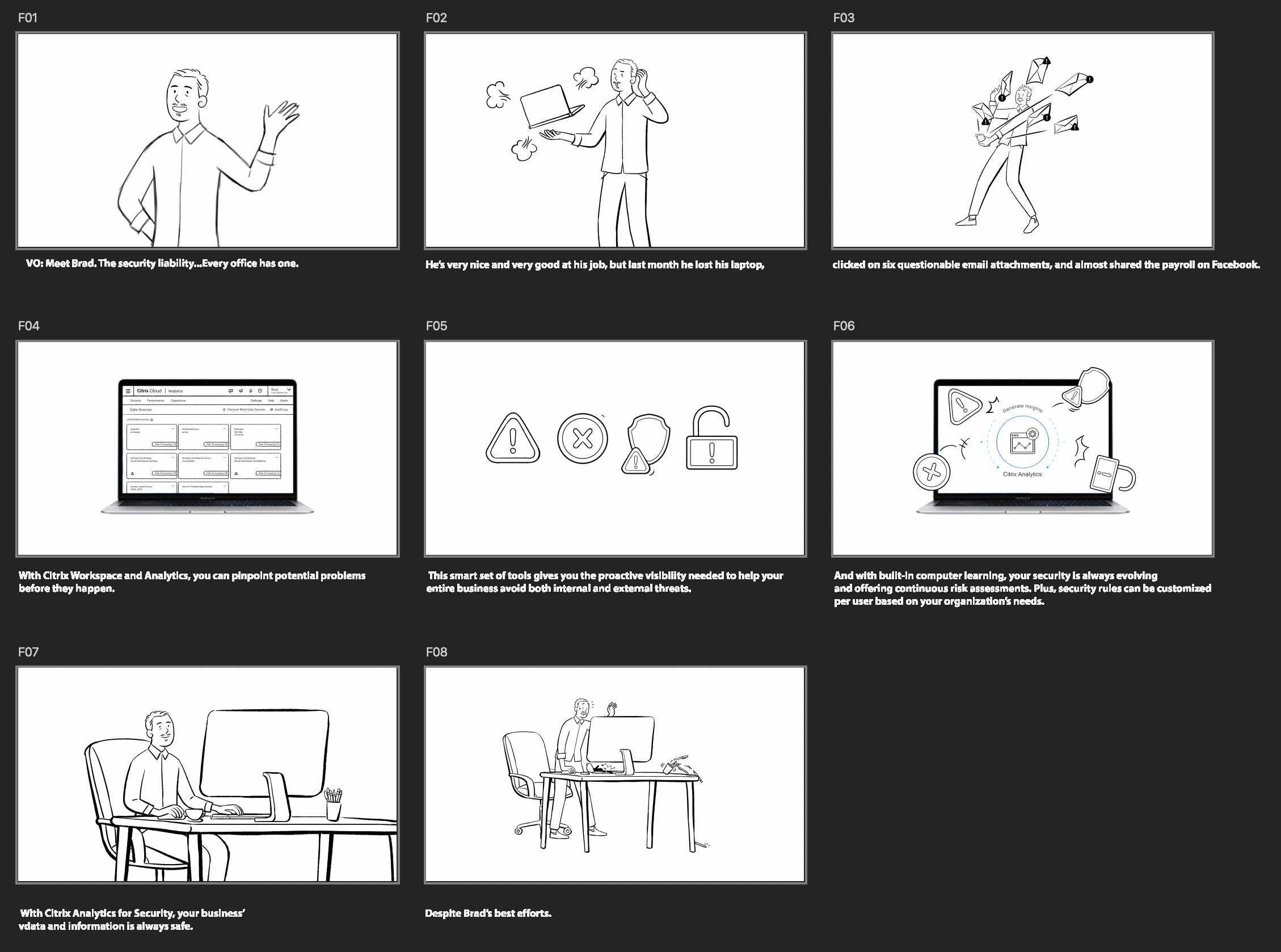
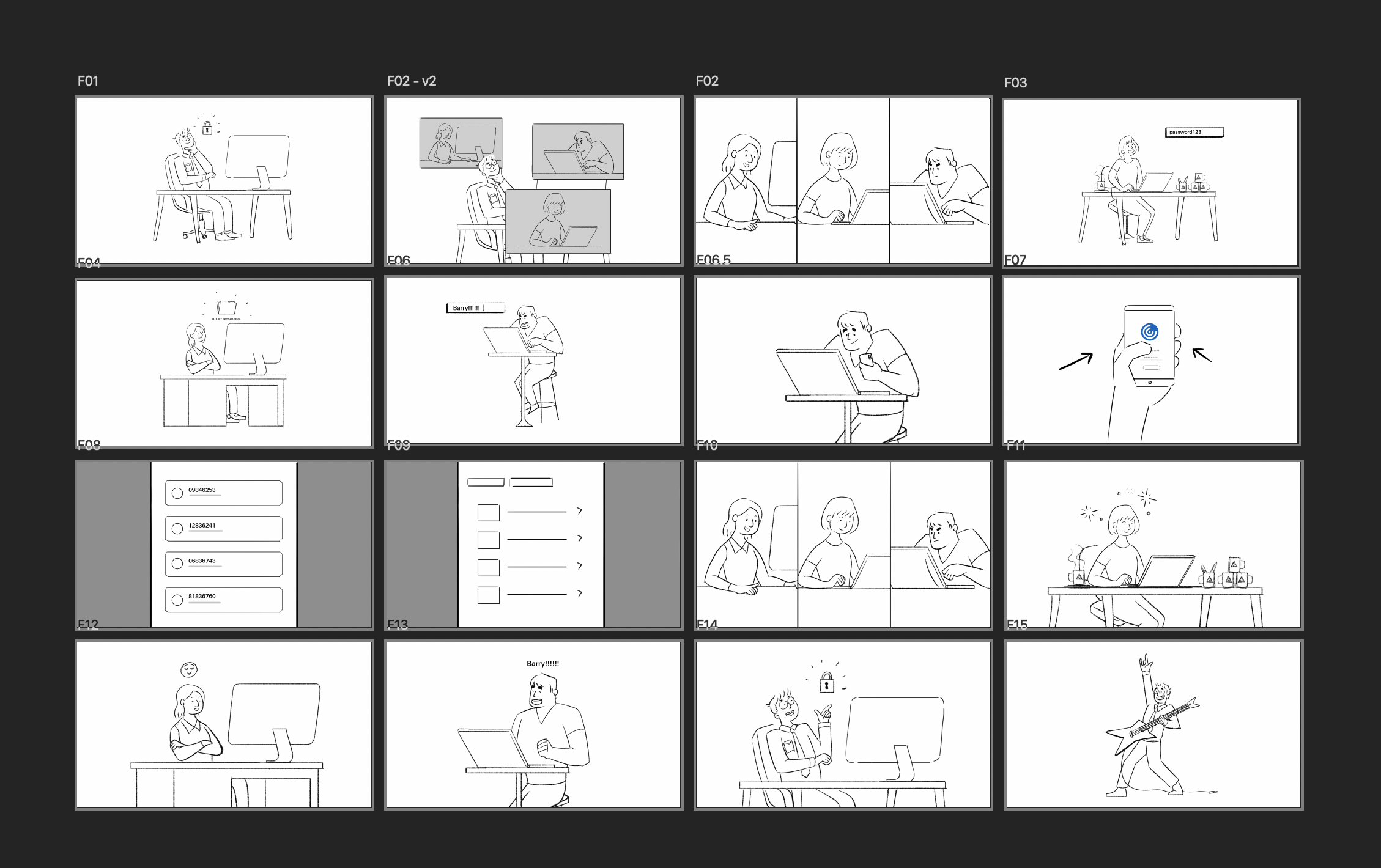
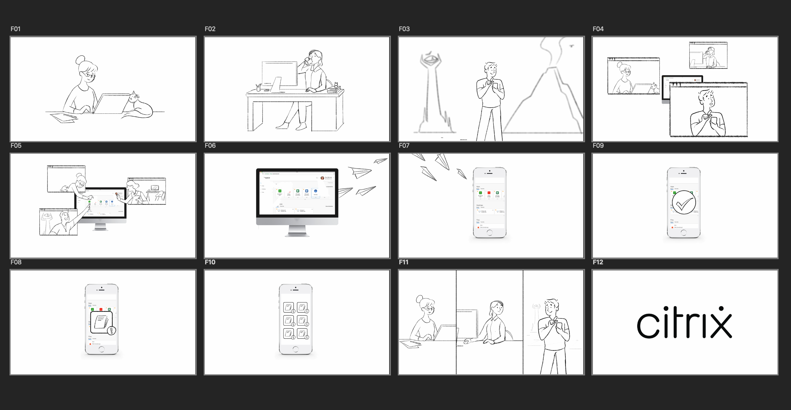
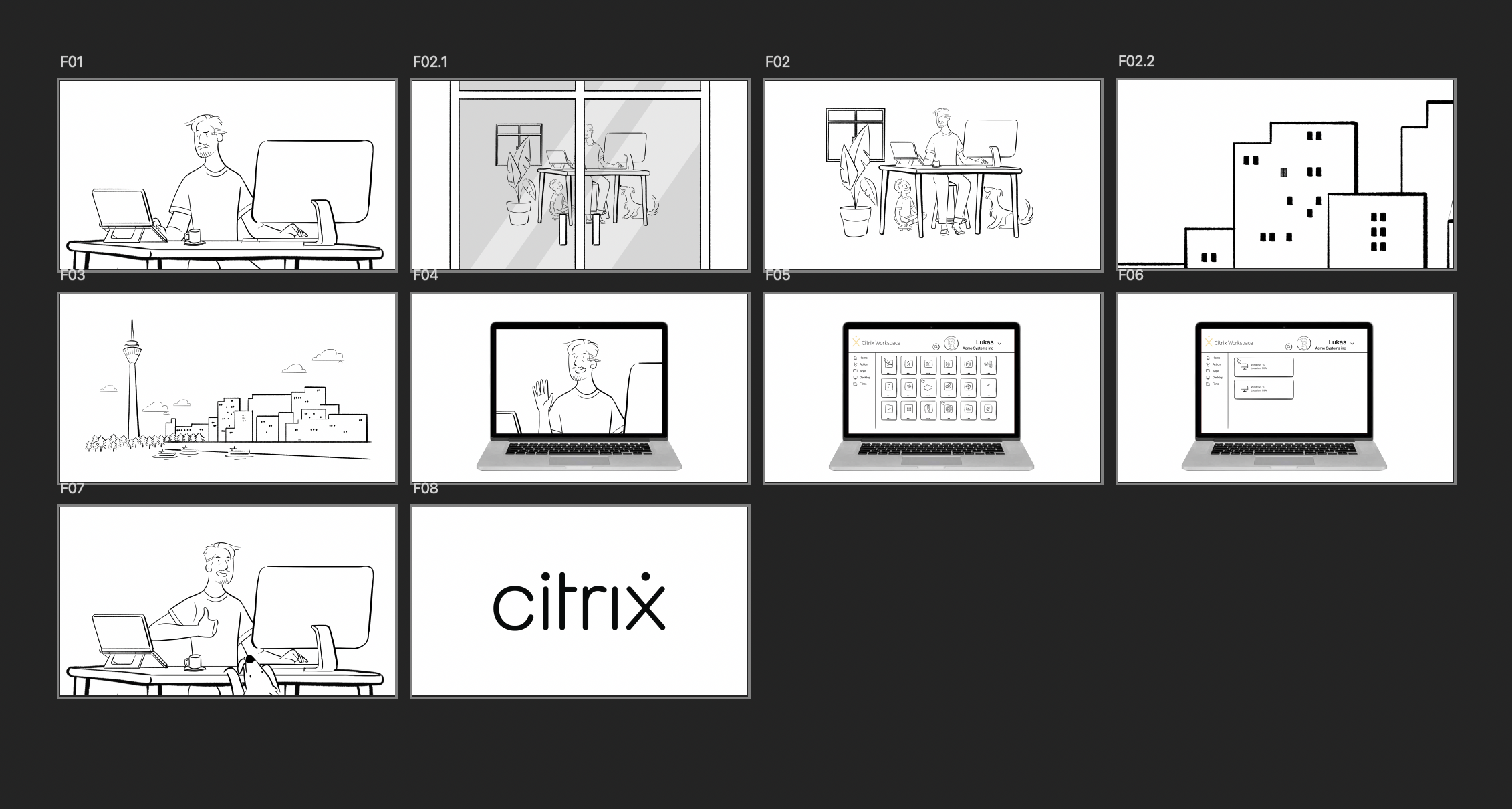
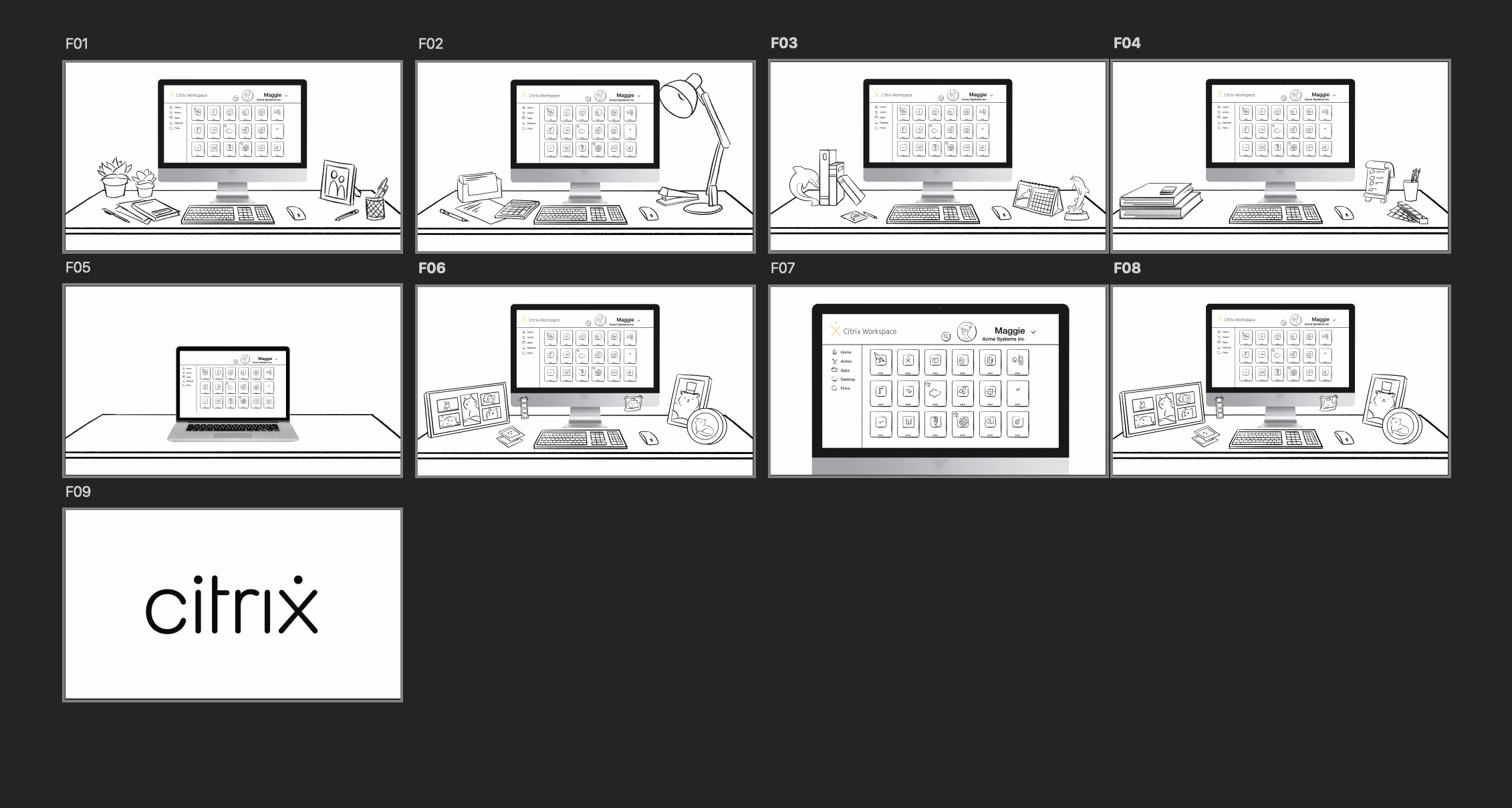
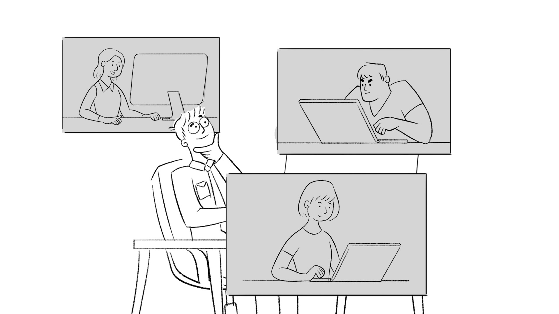
The early conversations set the tone. The agency wanted diversity that wasn’t decorative. They wanted characters shaped by actual lives, not brand archetypes. That responsibility came to us. Translate intention into form. Make inclusion visible without announcing itself. Scripts introduced people we all know. Emma reusing the same password everywhere. Claire burying logins in a “top secret” folder. Barry adding exclamation points until a password groans under its own enthusiasm. Maggie with her cat in the background. Lana in a quiet office. Michael in a space no one can ever place. Lukas logging in from Hawaii or Germany depending on the draft. Each character a small truth from the global workforce.
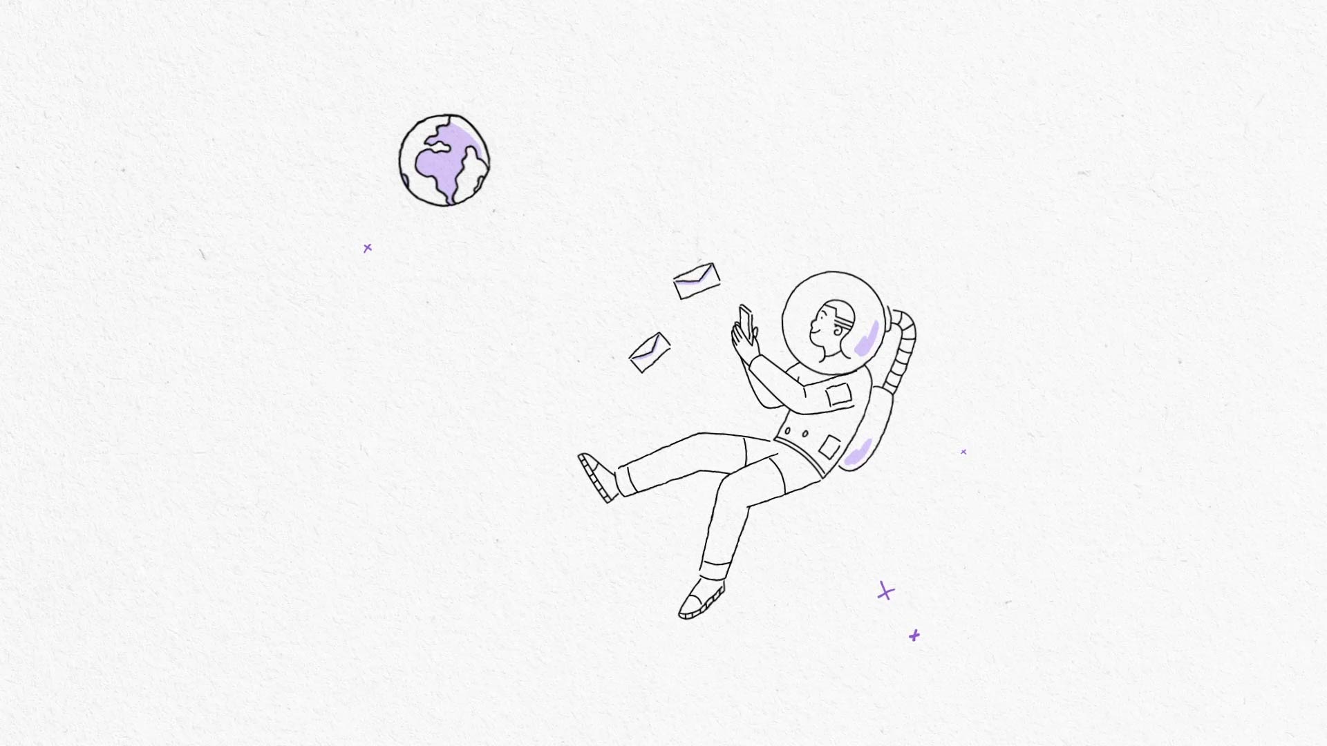
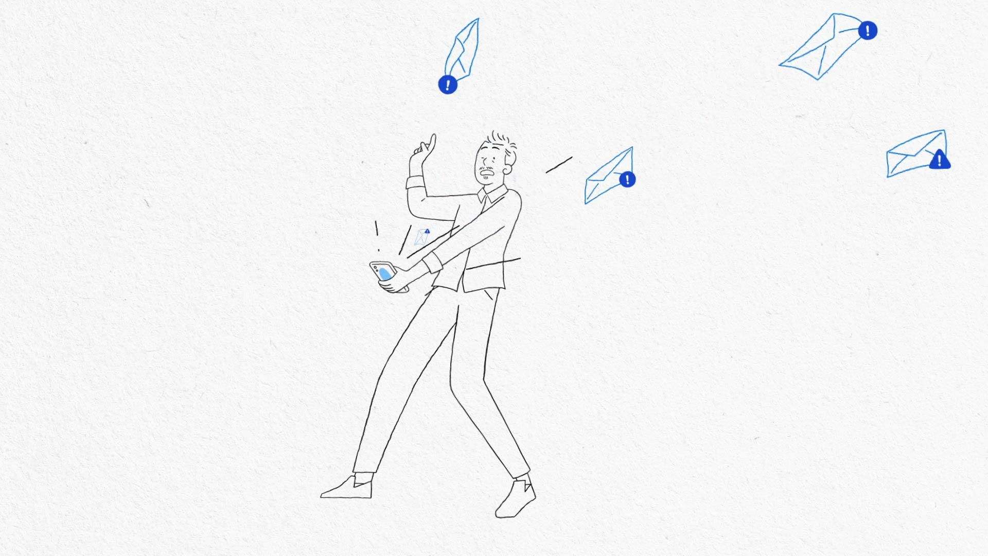
The design took that further. Line work that felt hand-drawn. Textures with human imperfection. Faces informed by a wide range of communities. Details that held culture without performing it. Hair, posture, desk setups, the clutter or the lack of it. A visual language more human than mechanical, more lived than rendered. The storytelling carried the same intention. Collaboration moved across screens and time zones. Security alerts became physical objects bouncing off the workspace. Characters reacted in ways that felt grounded. The humor came from recognition, never from exaggeration. As the series released, collaborators called out the craft. Third-party case studies surfaced. The films entered reels and public showcases. The product debates continued online, but the storytelling stood apart. It worked because it centered people, not software.
Behind the work
- Inclusivity shaped at the conversation level, not the script level
- Character design built from lived details, not generic personas
- Human-first visual tone reinforced through line, texture and motion
- Environments reflecting global work culture without stereotype
- Narrative choices built around real habits and recognizable behavior
.jpg)
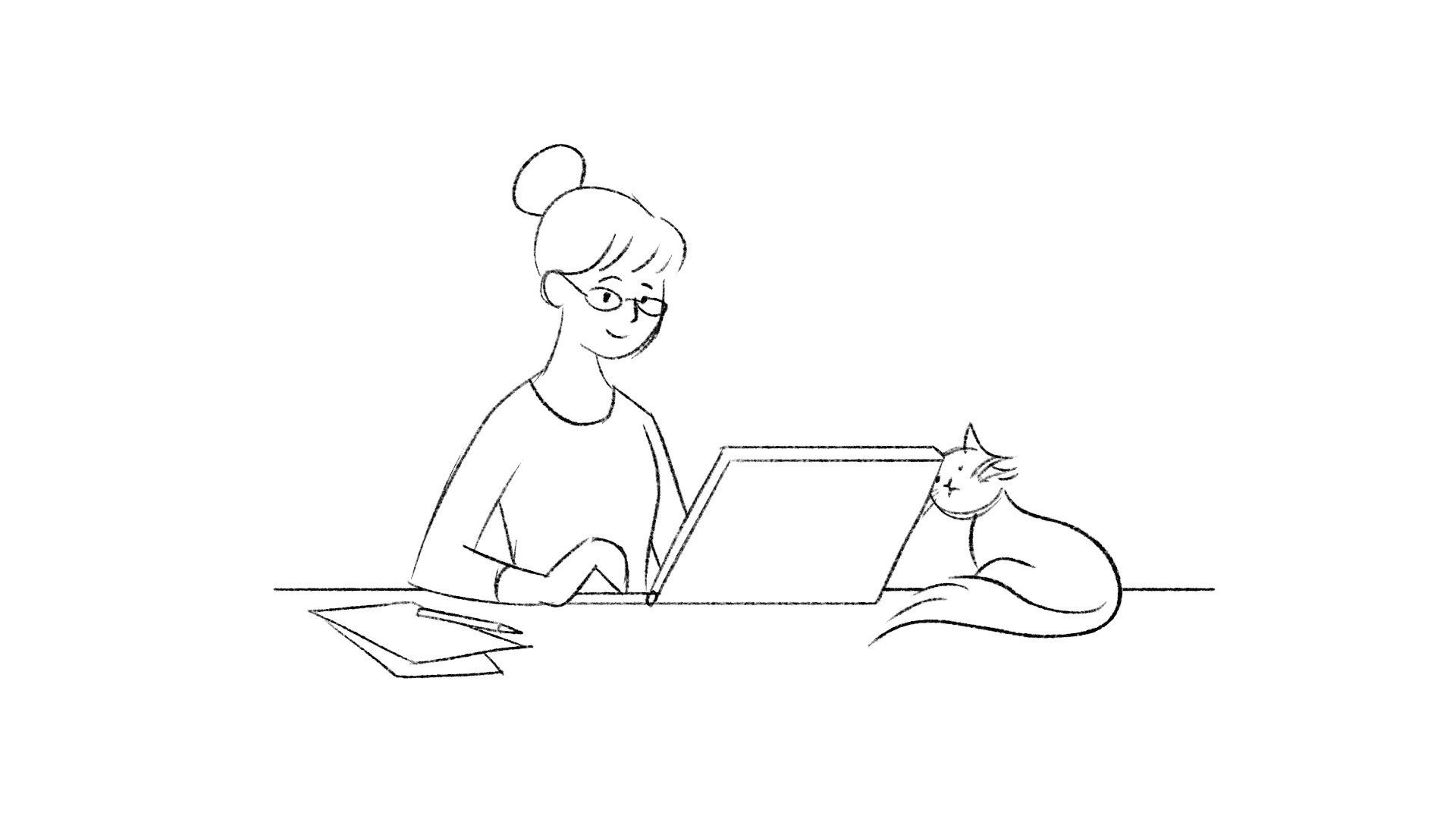
A workplace drawn from real people and the ways they actually move.