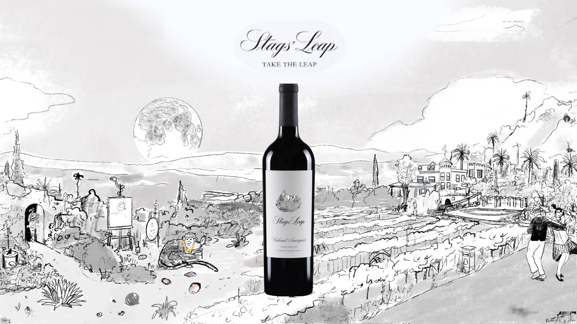
Stags’ Leap Winery × Annex88
Stags’ Leap Worlds
A surreal vineyard universe built from myths, creatures and roaring-era excess.
Why It Matters
Stags’ Leap wanted its mythology to feel alive. Not a label story. A world you could enter. Their earlier visuals sat flat on the screen, stuck in a lane that couldn’t hold the mystery they were trying to claim. The vineyard’s history had depth. The work needed to match it. The project asked a simple question. If a winery carries more than a century of legends, what does it look like when the world finally moves?
What we make
- Campaign illustrations for Worlds 1 to 3
- Surreal animations with outro legal frames
- AR social assets
- Key visuals in :30, :15 and :06 formats
- Sixteen 4:5 social posts in ProRes and MP4
- Layered PSD files for OOH
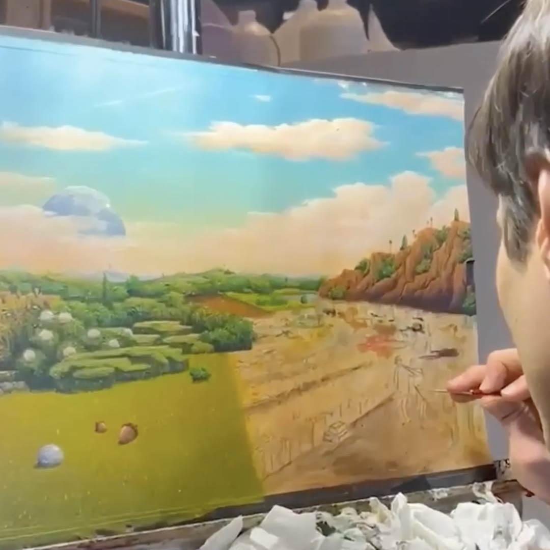
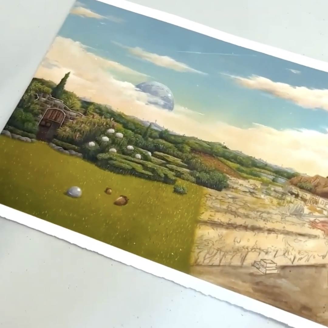
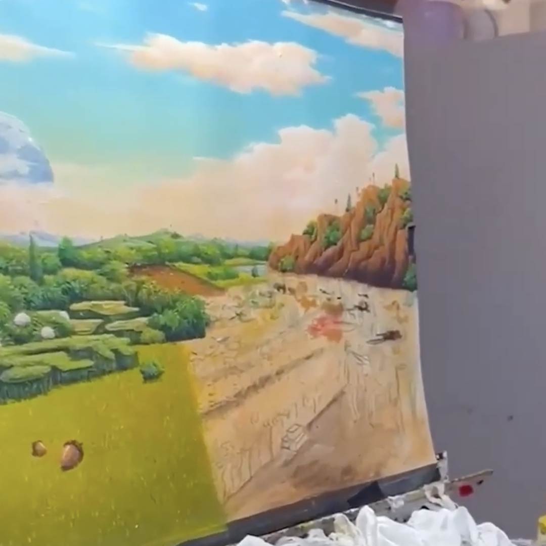
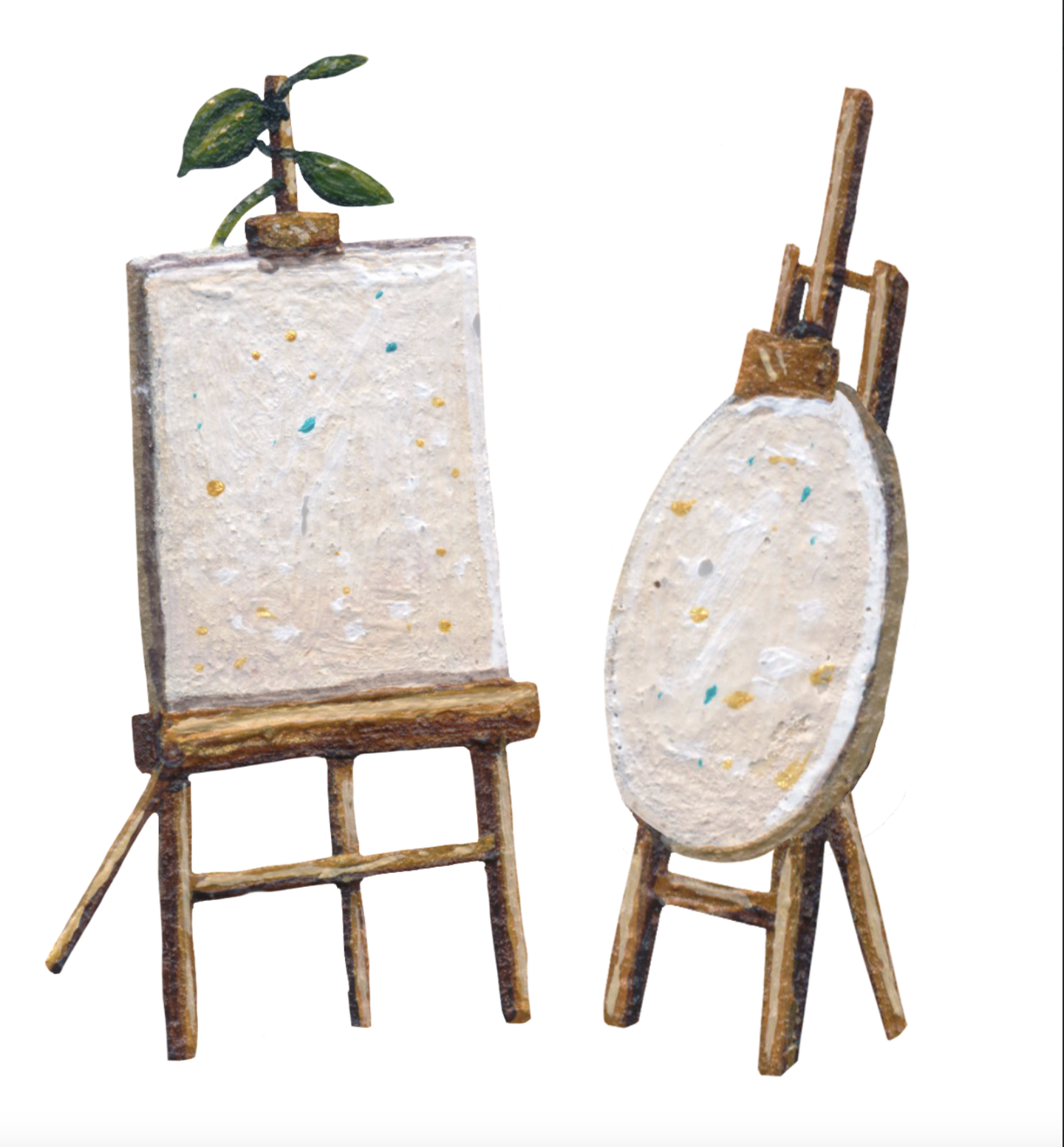
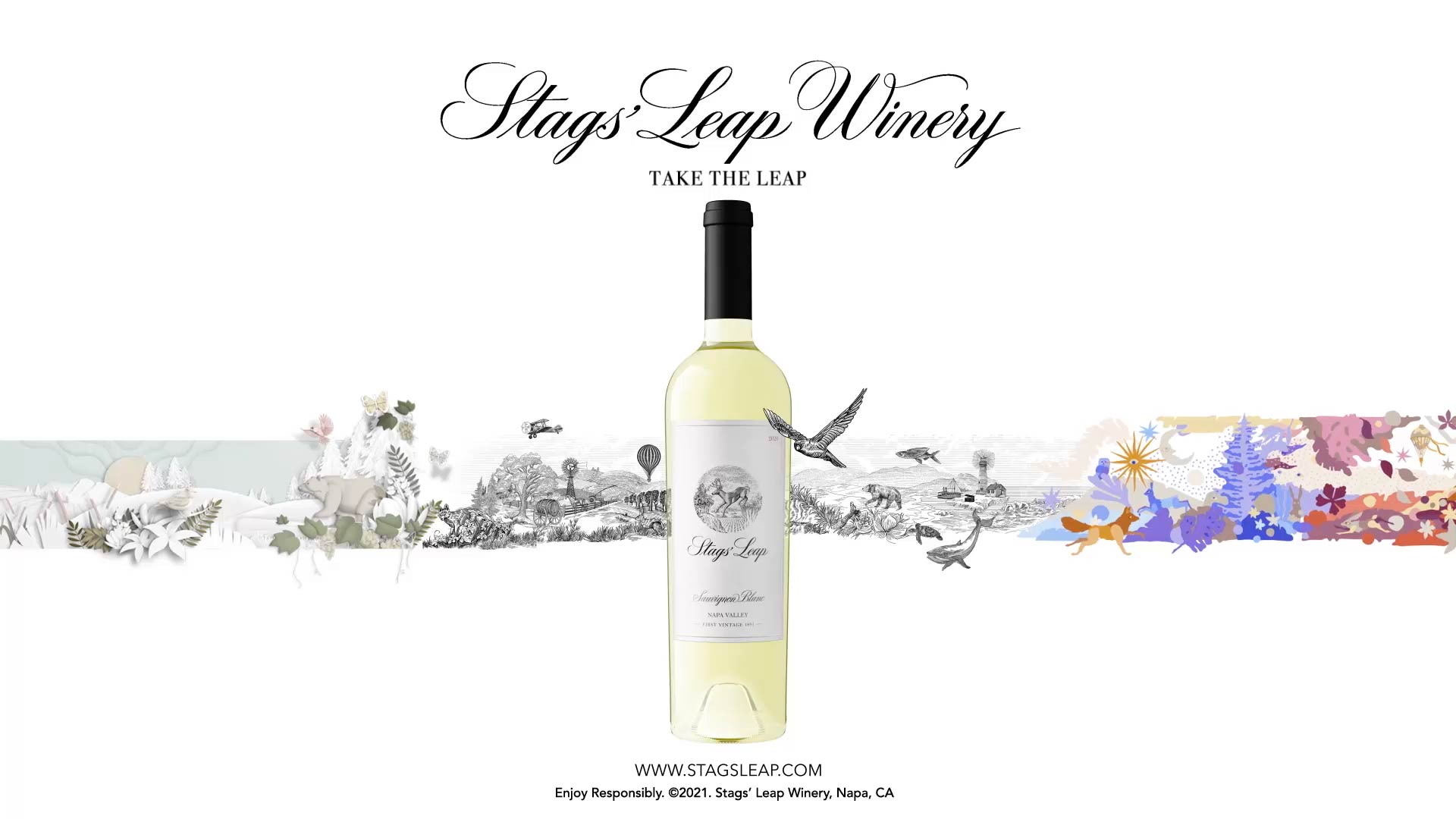
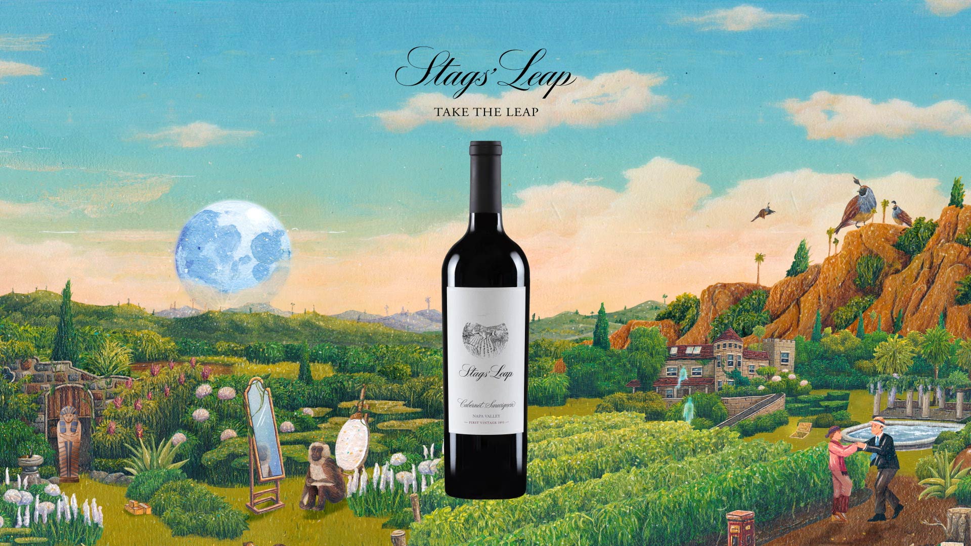
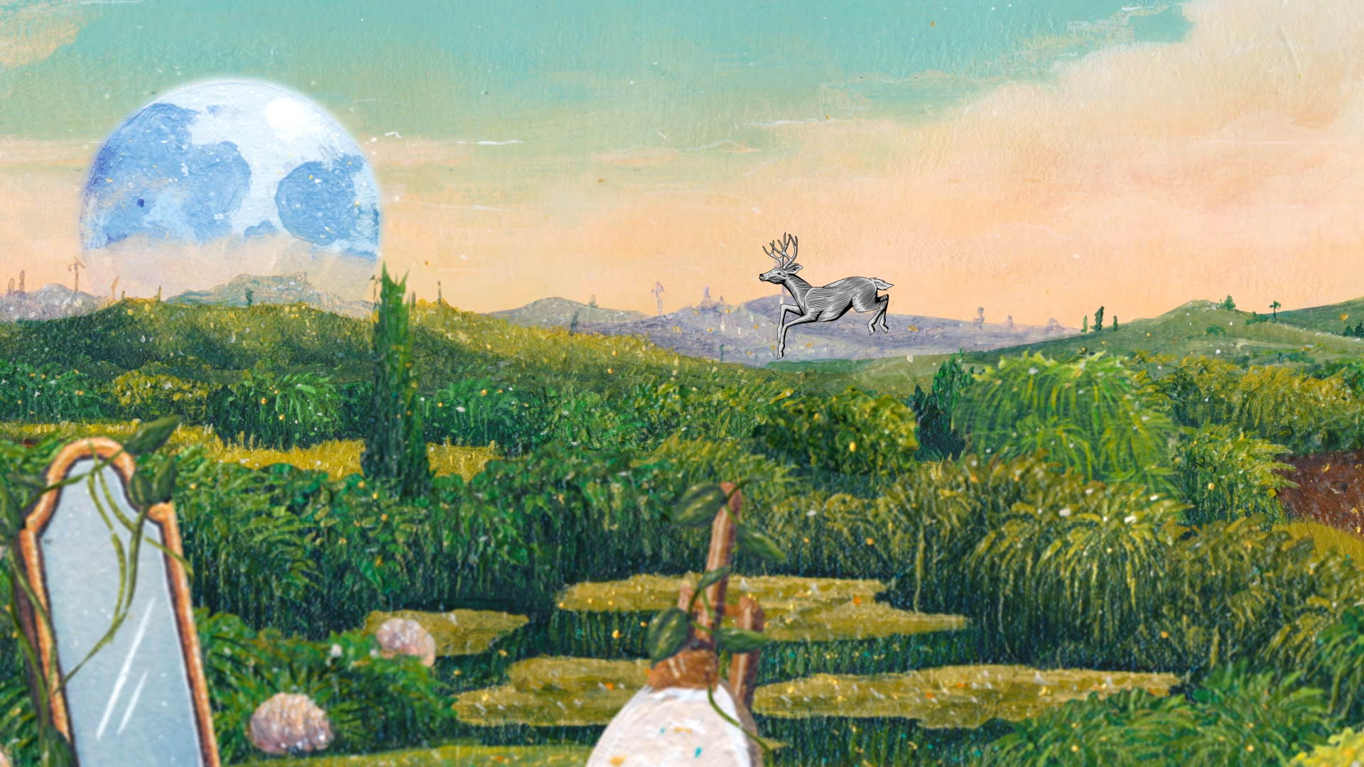
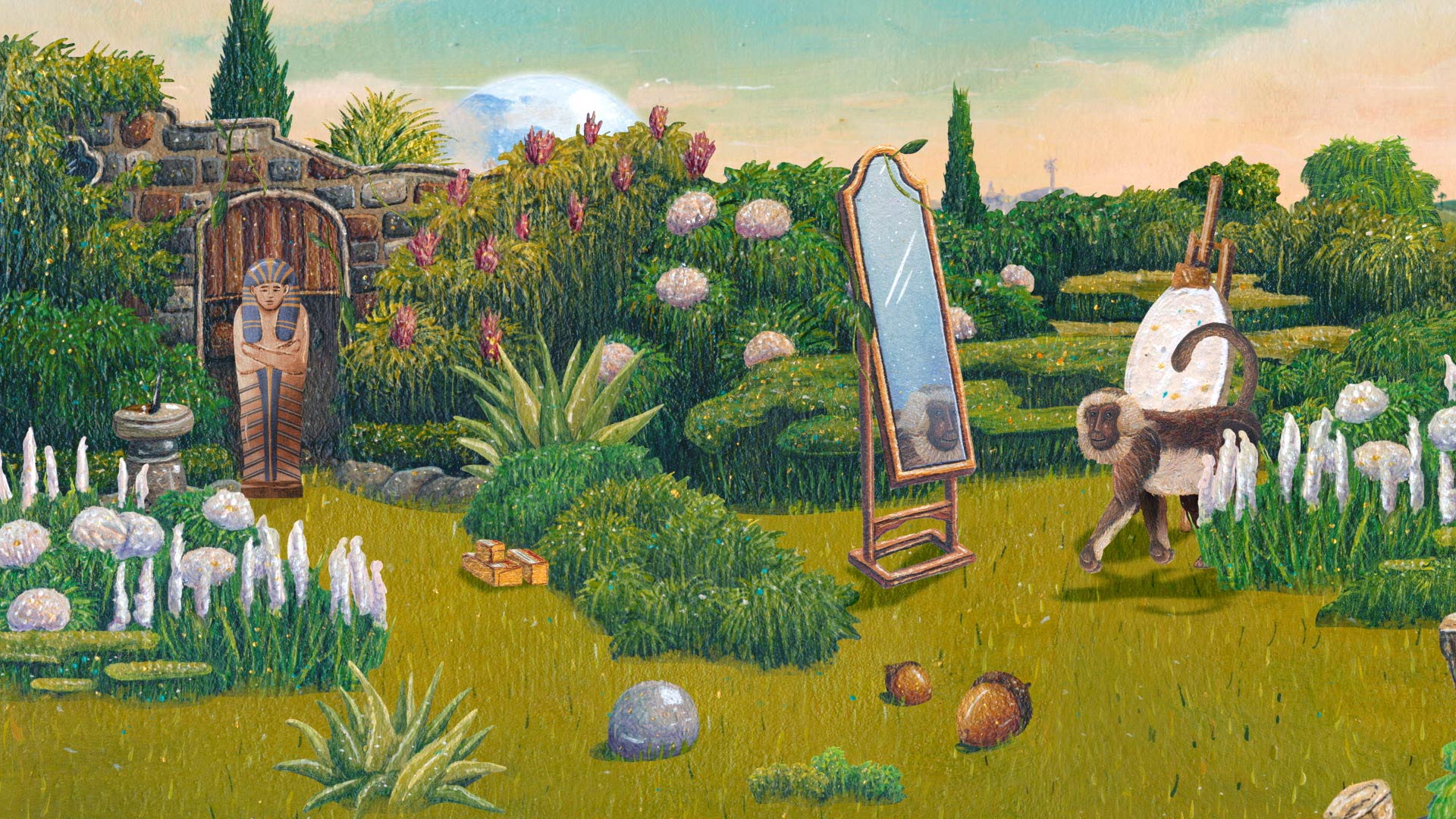
- Painterly illustrations by John Rego
- Press and PR materials for a virtual media event
The work shifted Stags’ Leap from static imagery to public-facing world-building carried across press, social and brand storytelling.
No items found.
Story
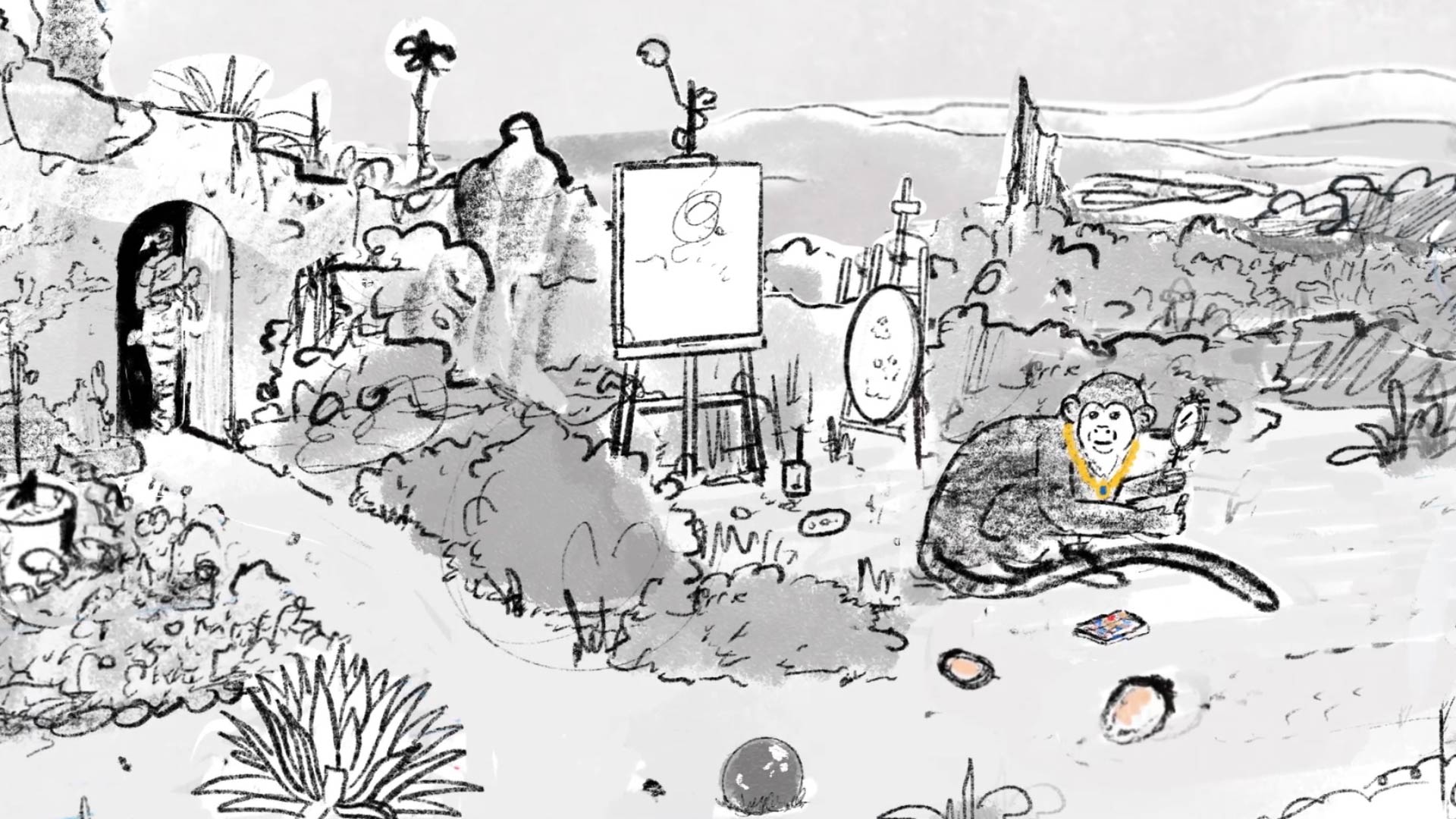
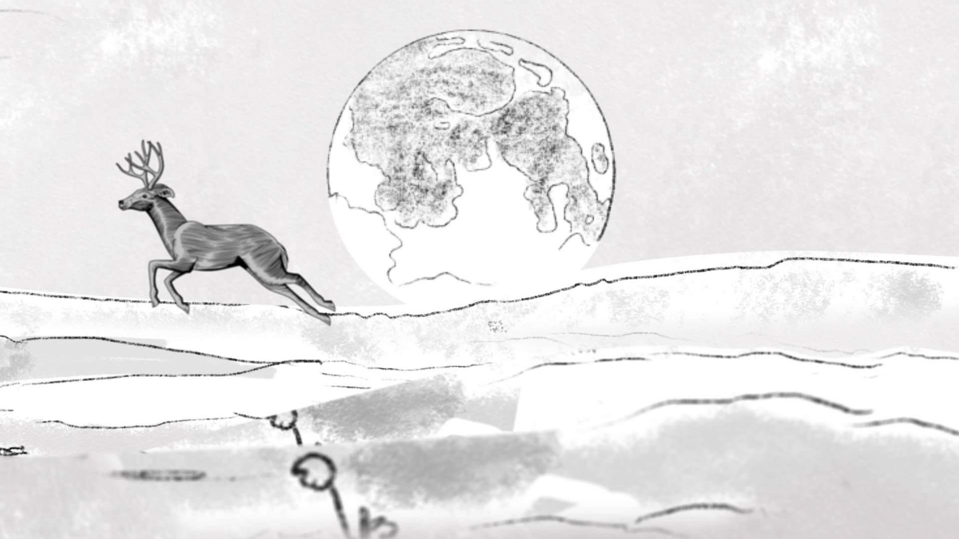
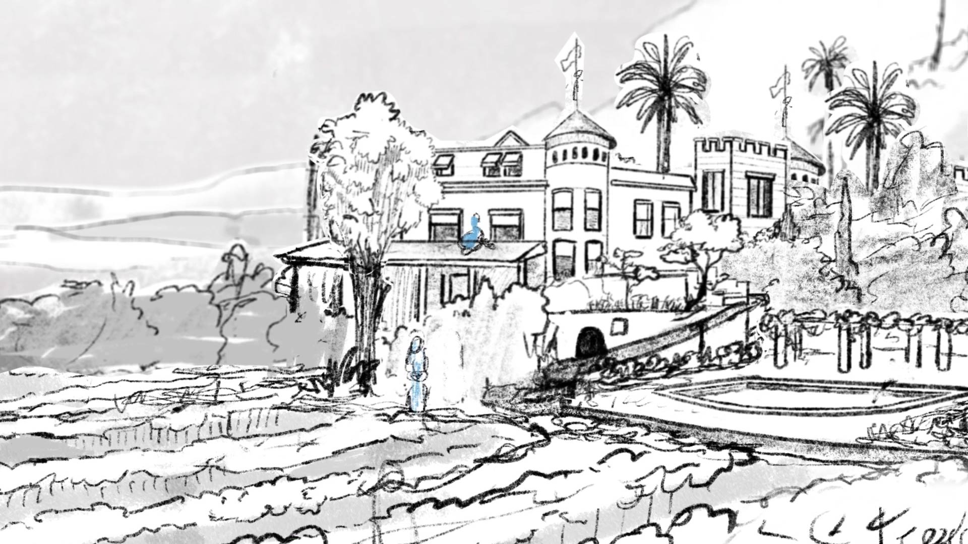
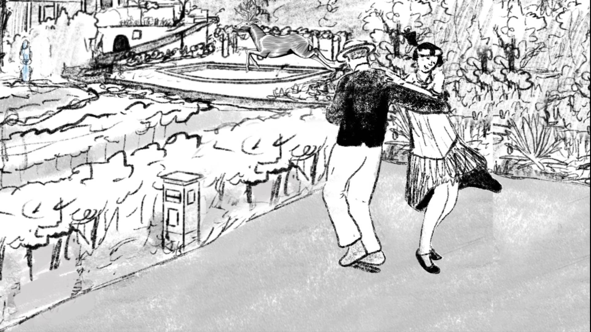
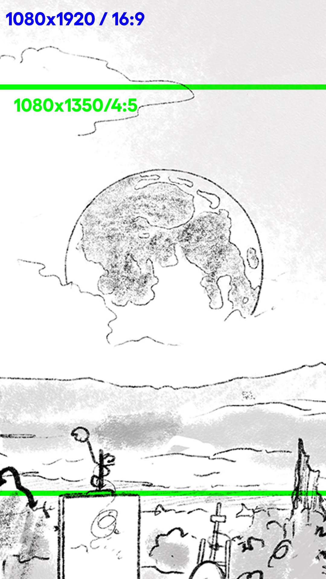
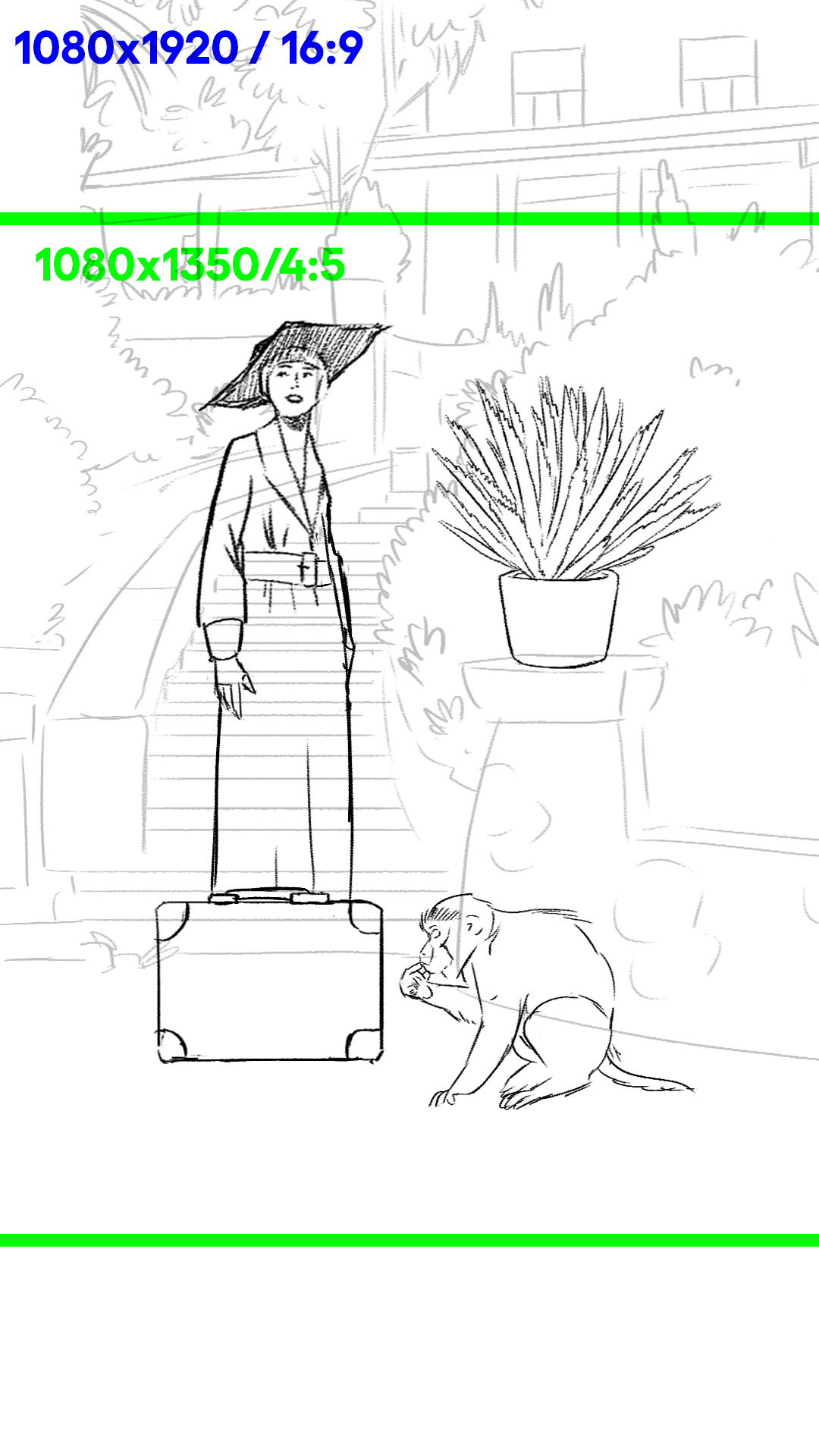
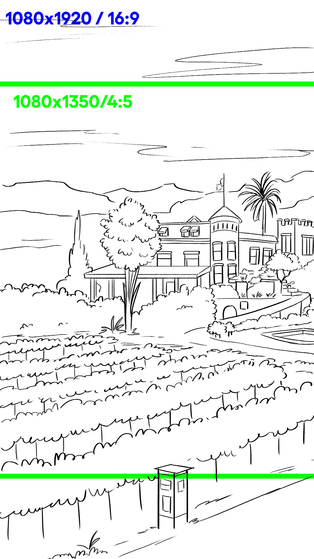
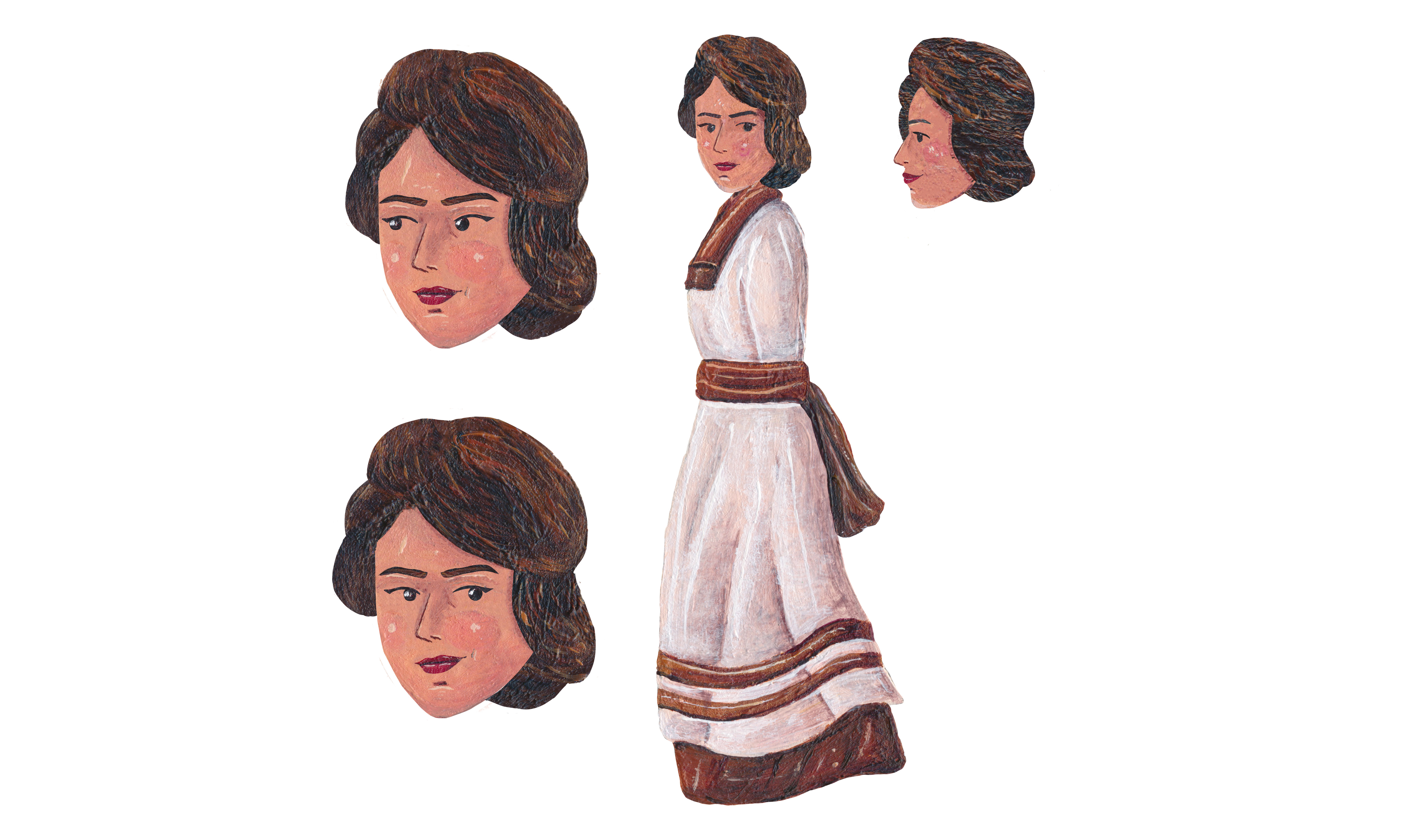
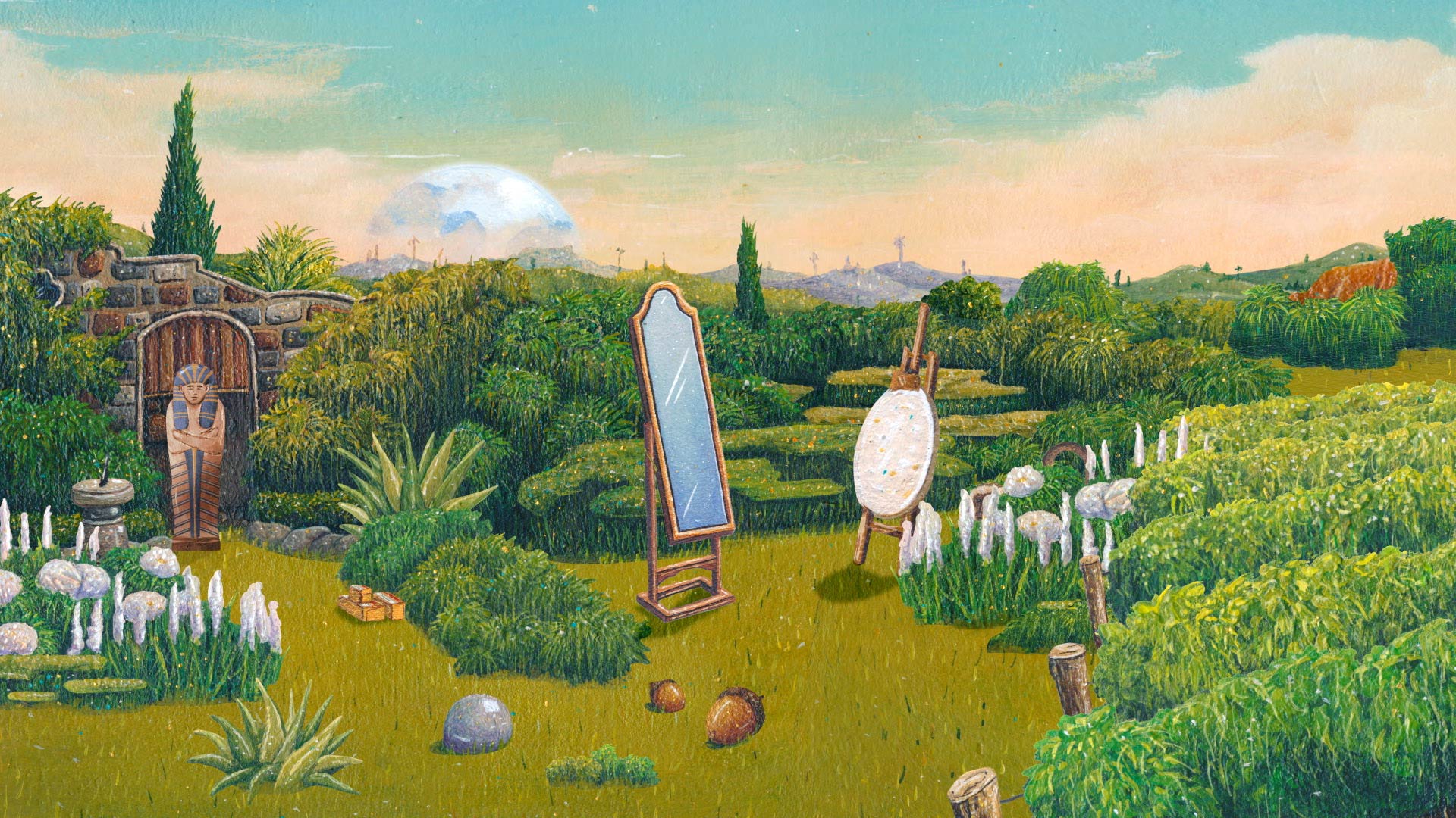
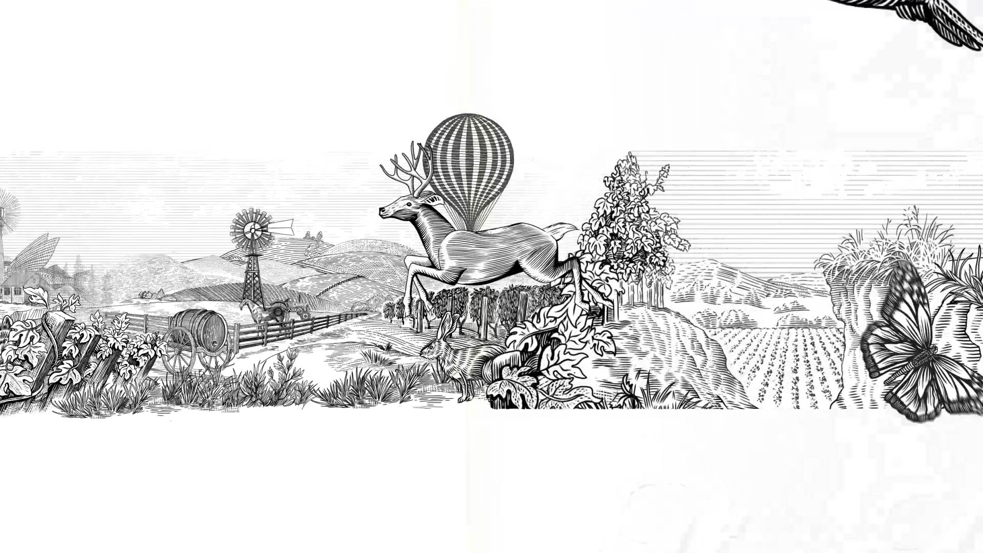
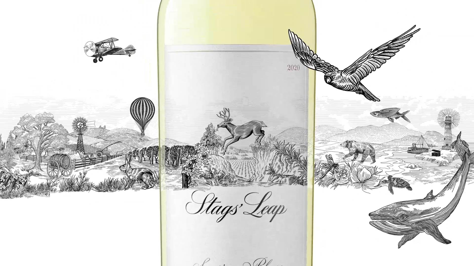
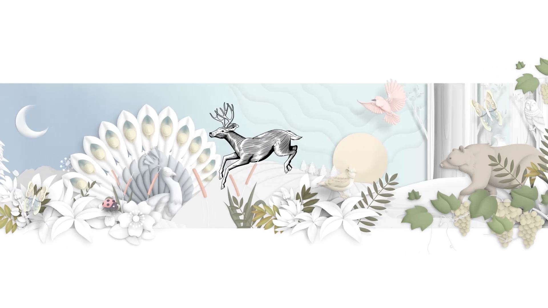
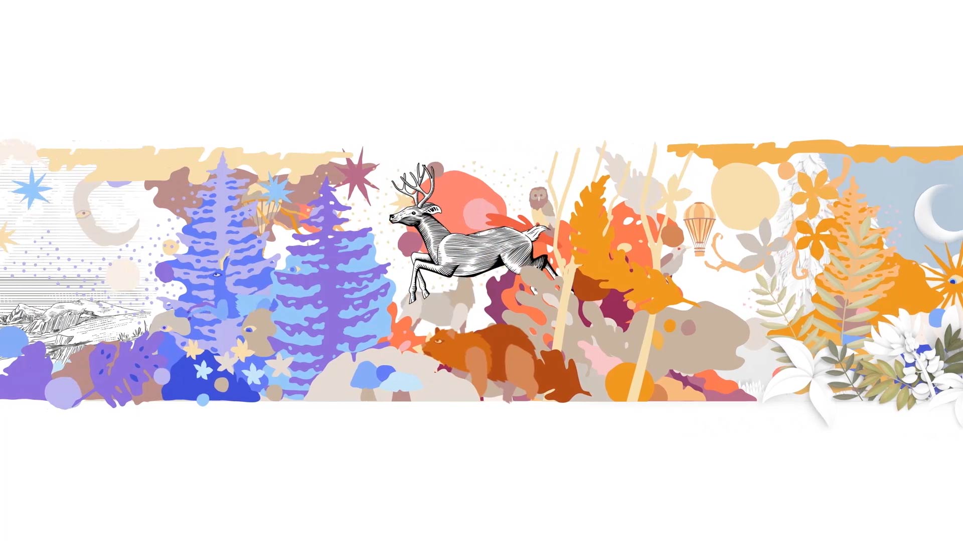
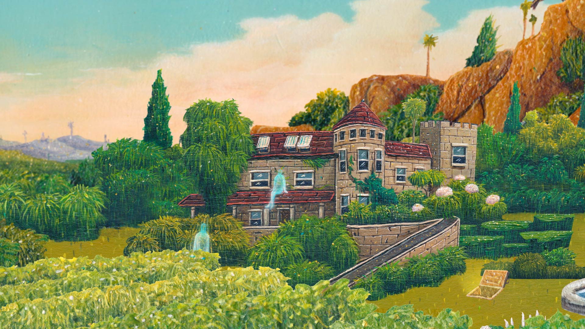
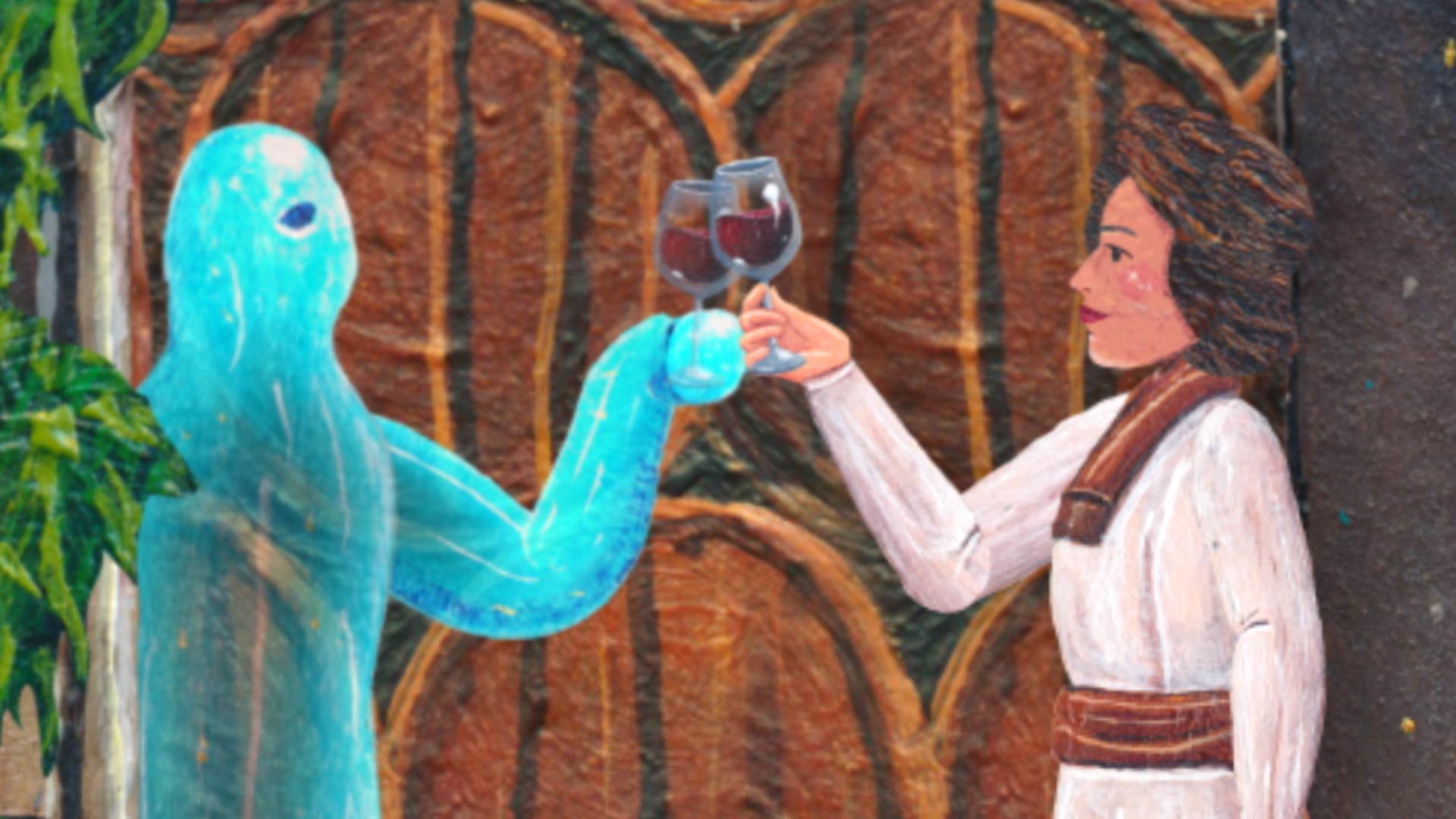
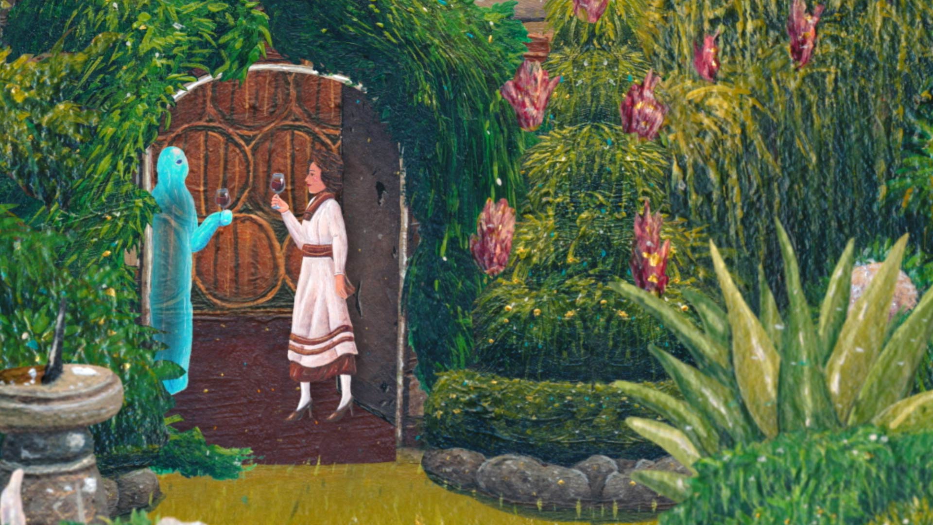
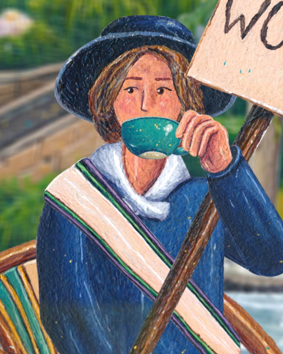
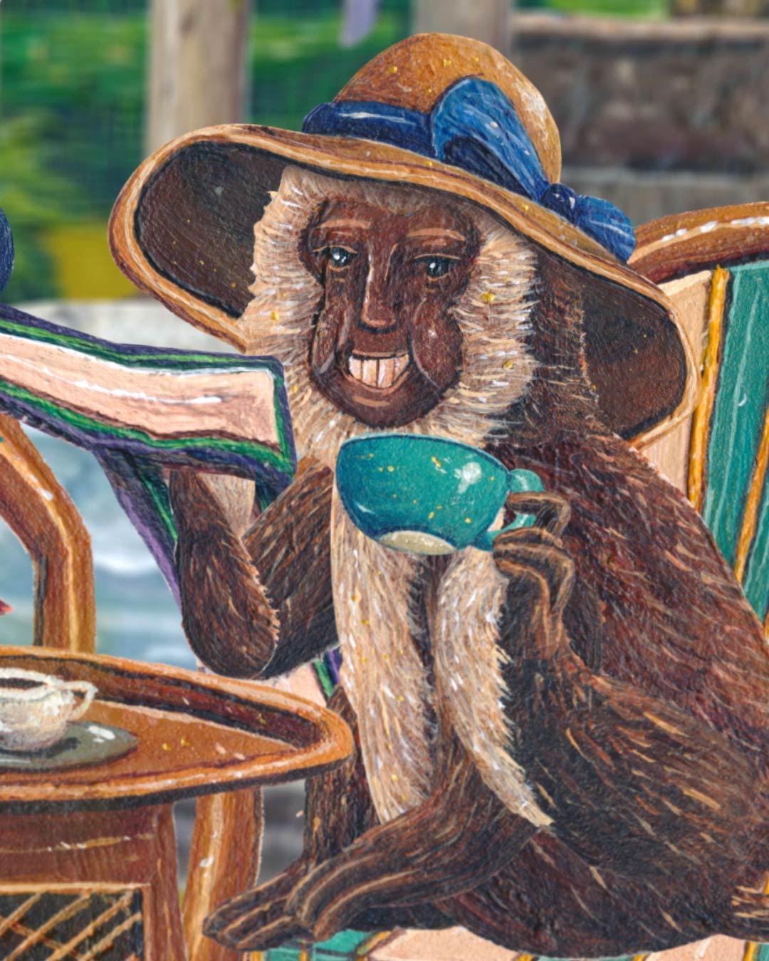
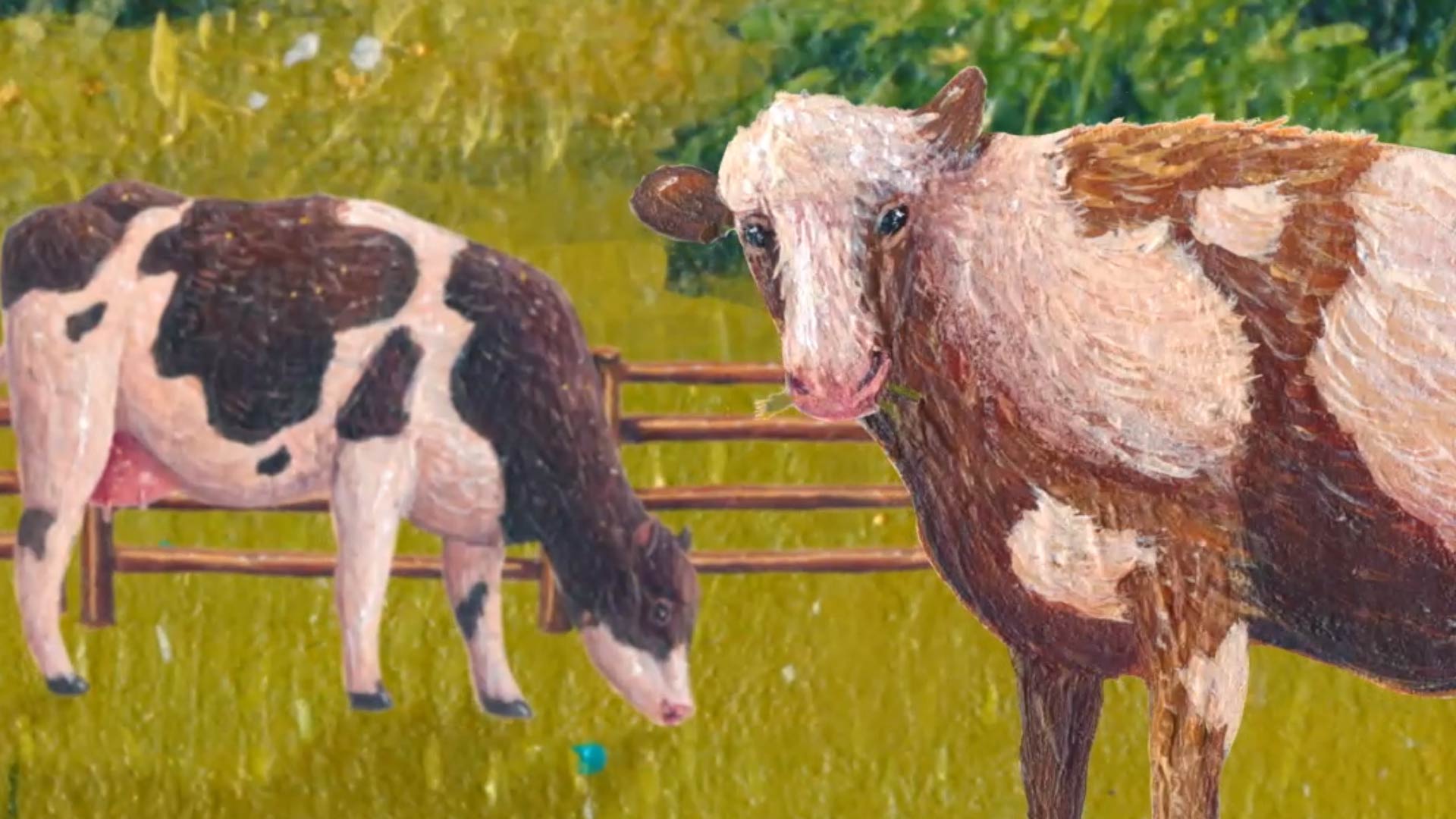
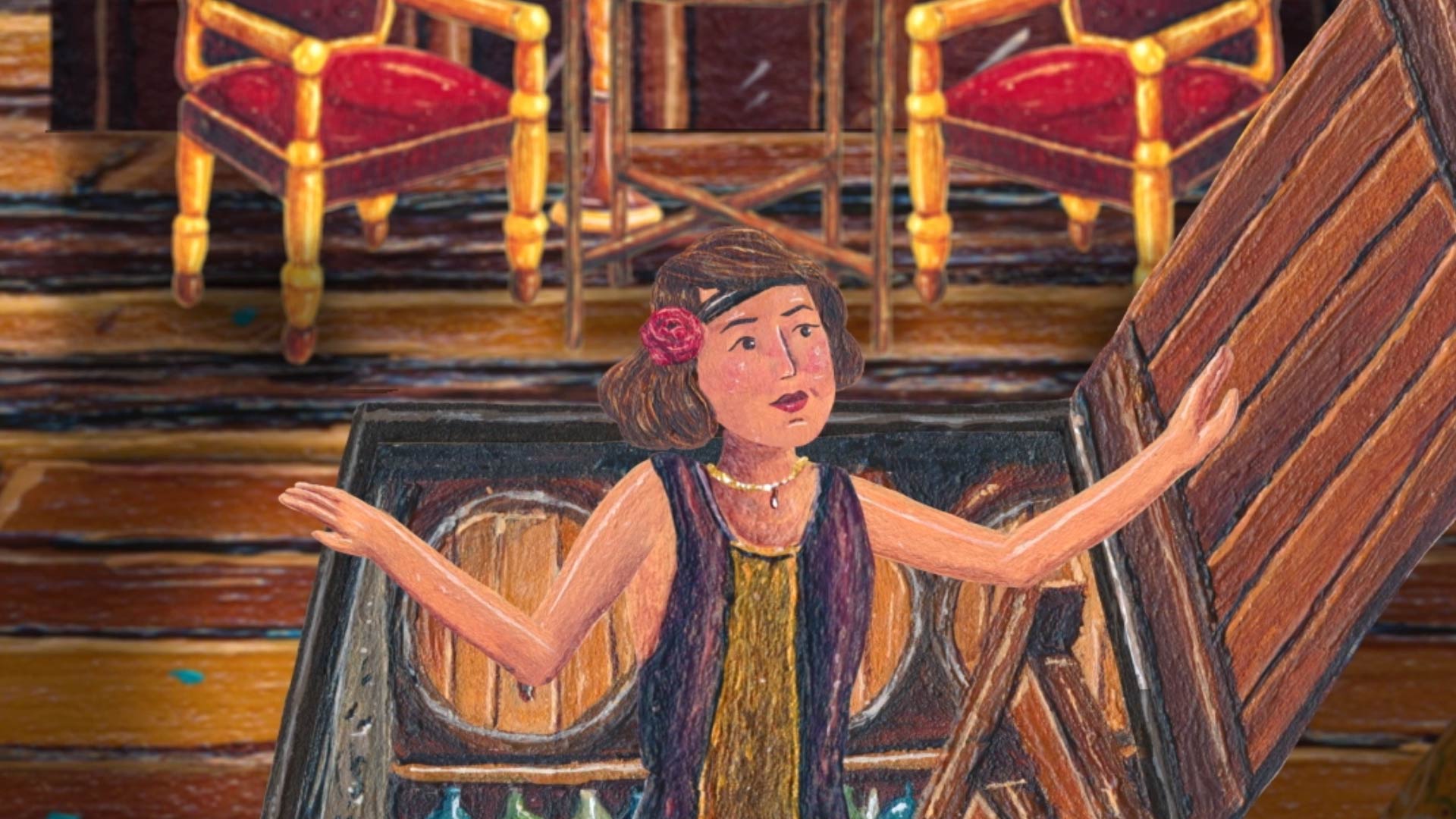
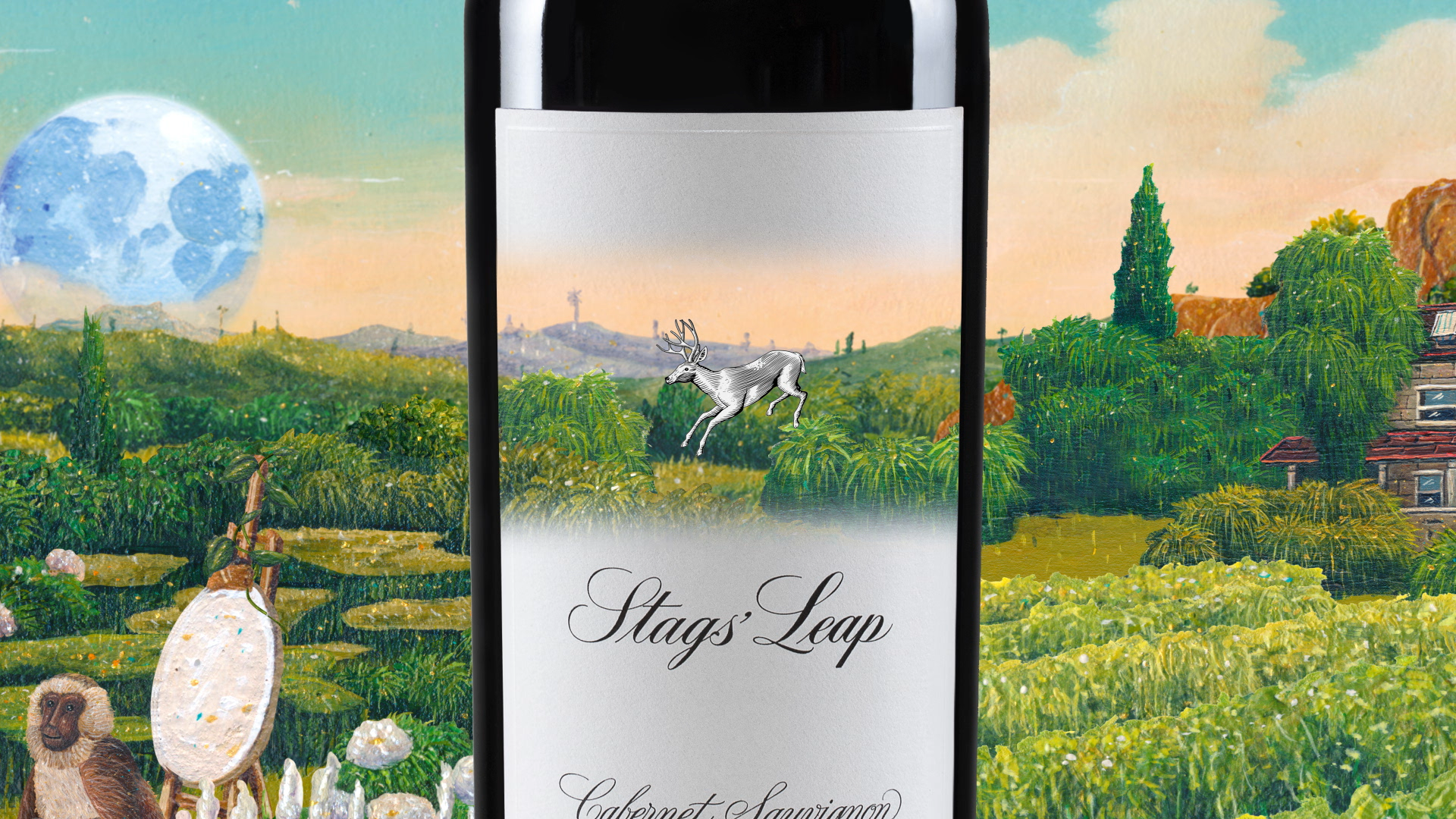
The brief arrived with a clear tension. A brand rooted in legend was speaking in two-dimensional pictures. A winery built on mystery needed space, depth and movement. The directive was bold. Great Gatsby energy. Oddities everywhere. A world rendered as if it lived in the 1920s and 30s. A stag. A mummy. A mischievous monkey. An explorer, a debutante and two ghosts. Historically accurate but fantastical. Rezonate shaped the worlds from the inside out. Not as illustrations but as spaces. Scenes with air, weight and physical distance. Motion that curved instead of marched forward.
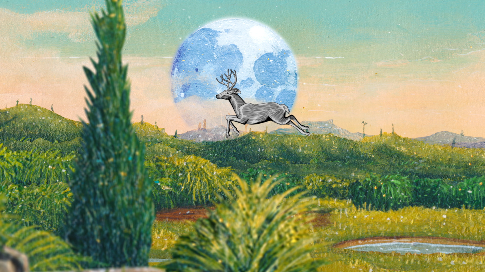
The work expanded. Surreal frames layered into animated landscapes. Characters moved through painterly color and overgrown detail. The brand’s mythology became a place instead of a picture.
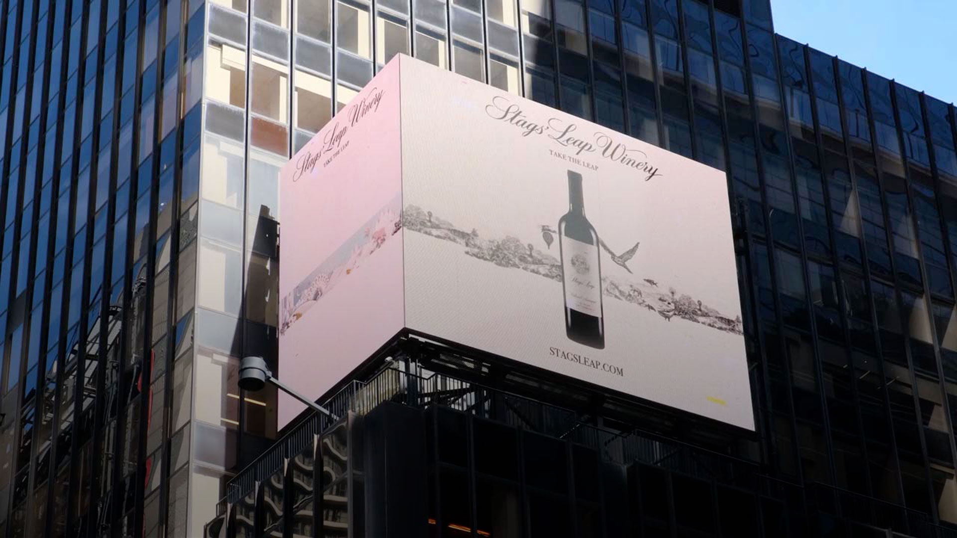
When the campaign reached press, the shift was clear. Media treated the work as world-building rather than marketing material. Seventeen publications stepped into the universe and amplified it. The winery secured a full rights buyout. The agency earned new business because the work proved its value in the wild.
The worlds had texture now. They held history, tension and playfulness all at once.
Behind the work
- Spatial animation built from painterly layers
- Era-true textures drawn from 1920s and 30s references
- Character design rooted in the winery’s folklore
- Iterative surrealist adjustments to density, oddities and props
- Artist-centric development with shared authorship
- Dimensional motion to break the brand out of its linear past